IADT Student Services - Student Services Redesign & Accessibility
Improved task completion by 50% by redesigning the IADT student services experience for users with ADHD.
Students struggled to find key information, maintain attention and recognise available services. Through interviews and usability testing with ADHD students, I restructured the experience to reduce cognitive load and support faster, more intuitive navigation.
UX Research | Accessibility | UI Design | 2024 | MSc Research Project
Research & Key Insights
Background Research – Understanding ADHD
Adults with ADHD often experience challenges with:
Activation (starting tasks)
Users report difficulty initiating tasks, even when they understood their importance.
Sustained Focus
Attention often drops during longer or less engaging interactions.
Working Memory
Users struggle to retain and process multiple, pieces of information simultaneously,
Emotional Regulation
Frustration increases when tasks feel unclear or overwhelming.
Overwhelmed with Dense Information
Information heavy screens lead to cognitive overload and disengagement.
These insights highlighted the need to reduce cognitive load, simplify navigation, and support task initiation, directly informing the design approach.,
Sources:
ADHD Ireland
Very Well Mind
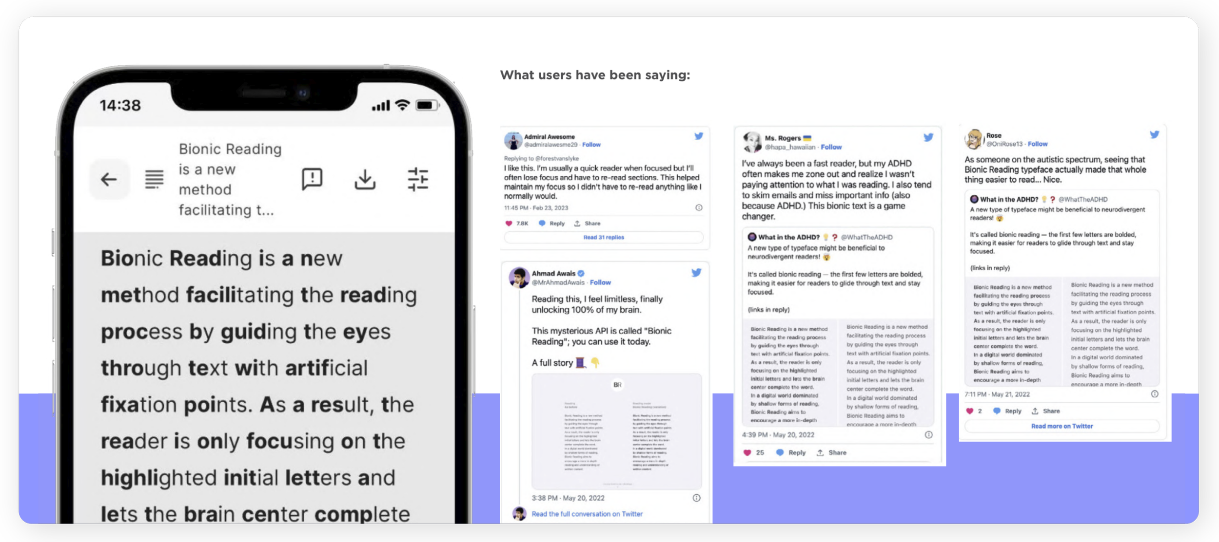
Evaluated impact on perceived readability with bionic reading
While some users reported improved focus and reading speed, feedback was mixed,
where others found the format distracting or unnatural.
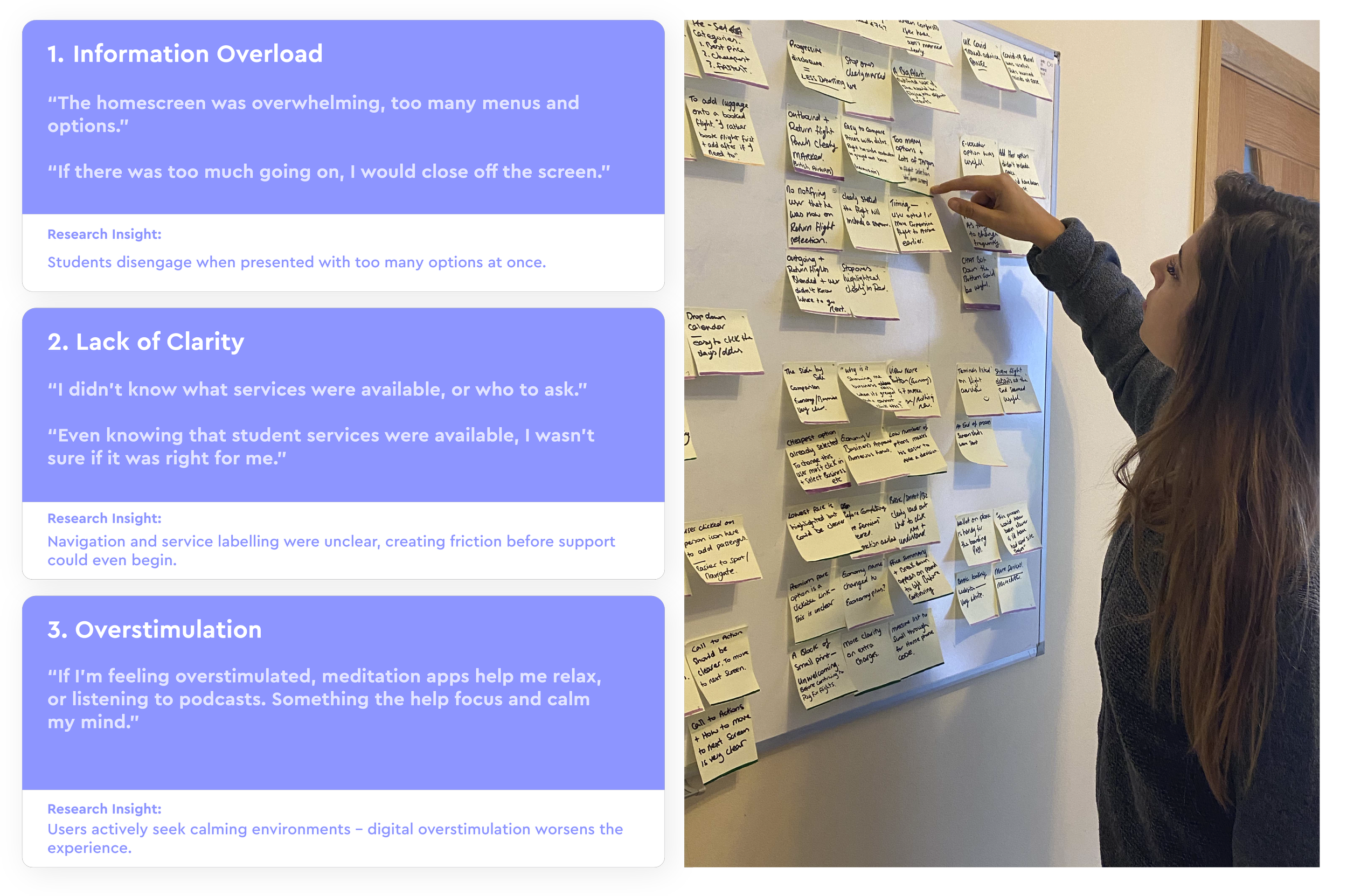
ADHD Student Survey
Results & Insights
Distributed the survey to the students in IADT, synthesised the results through affynity diagrams and this was some of the responses that came back.
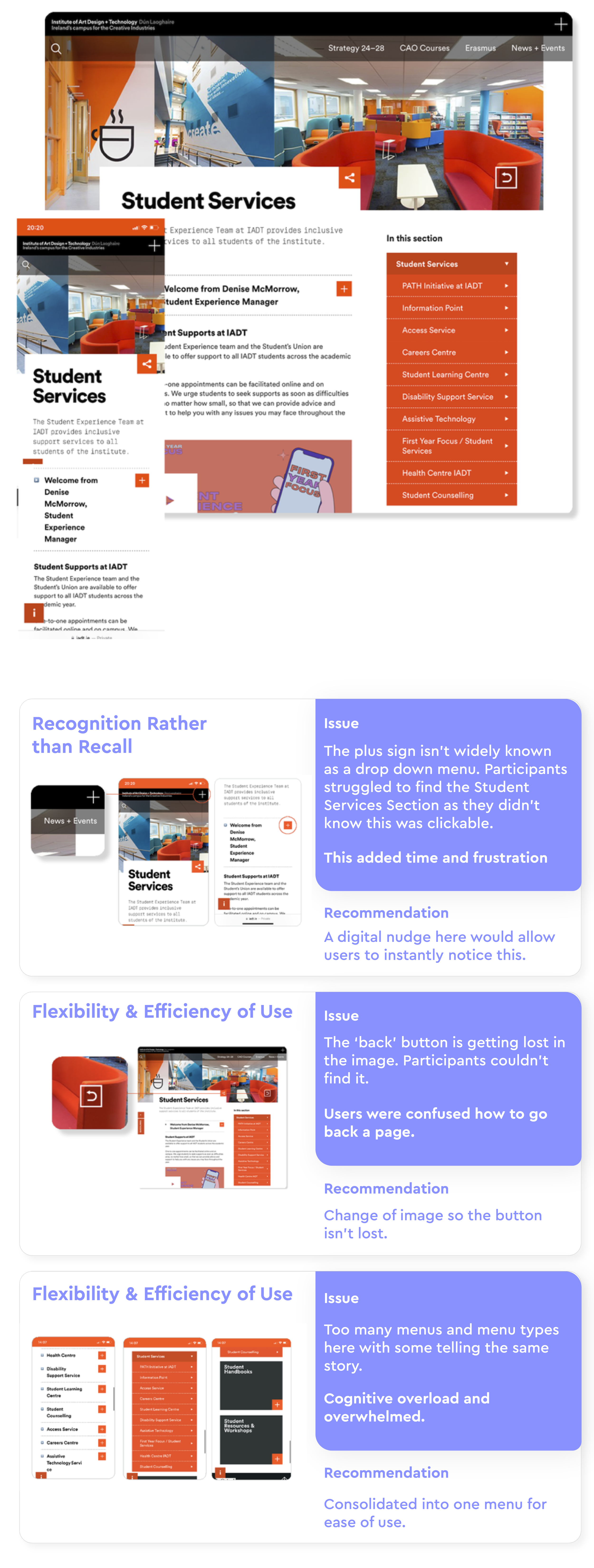
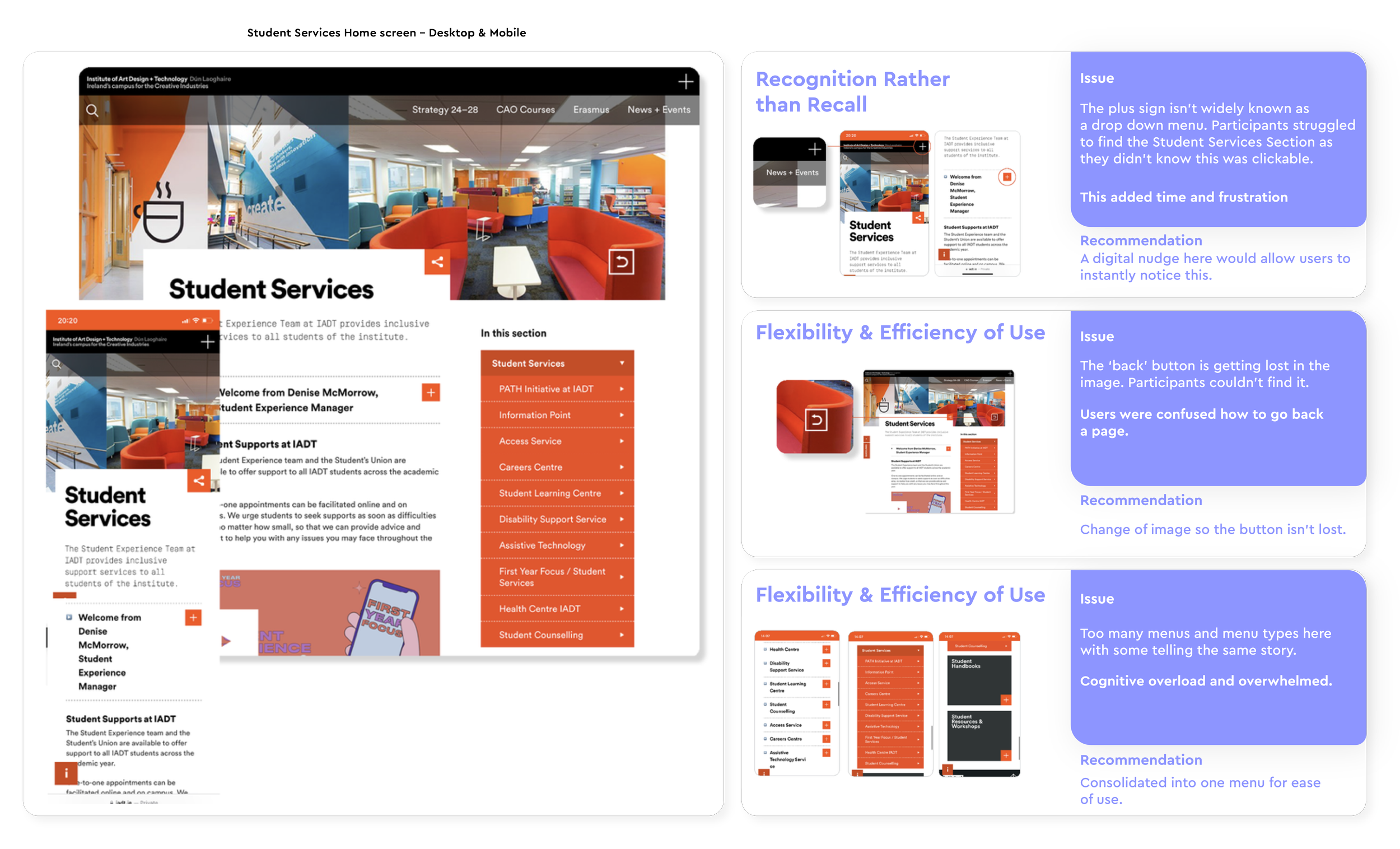
Usability Testing on the current site

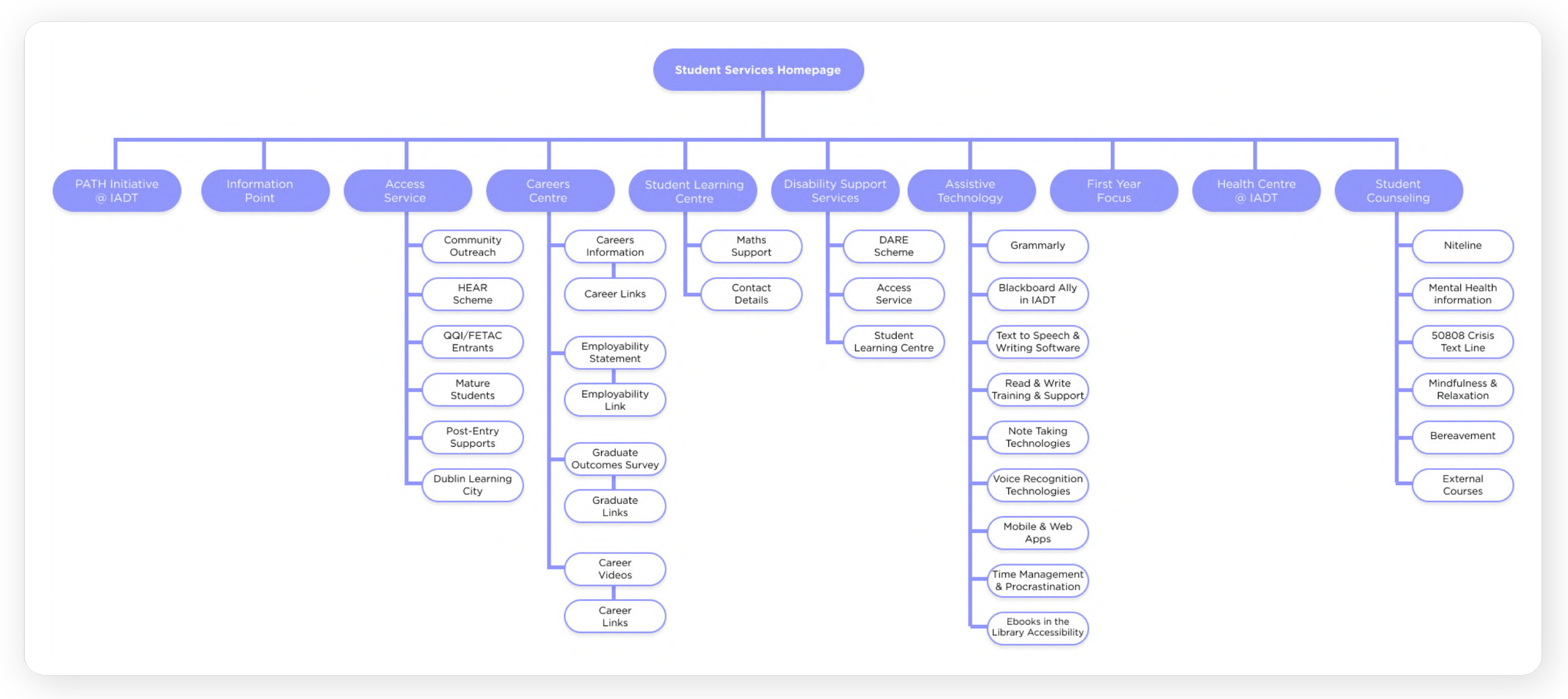
Existing Information
Architecture Audit
The diagram maps the current Student Services structure as it exists today.The goal was to understand content sprawl, overlapping categories, and depth of navigation before proposing structural changes.
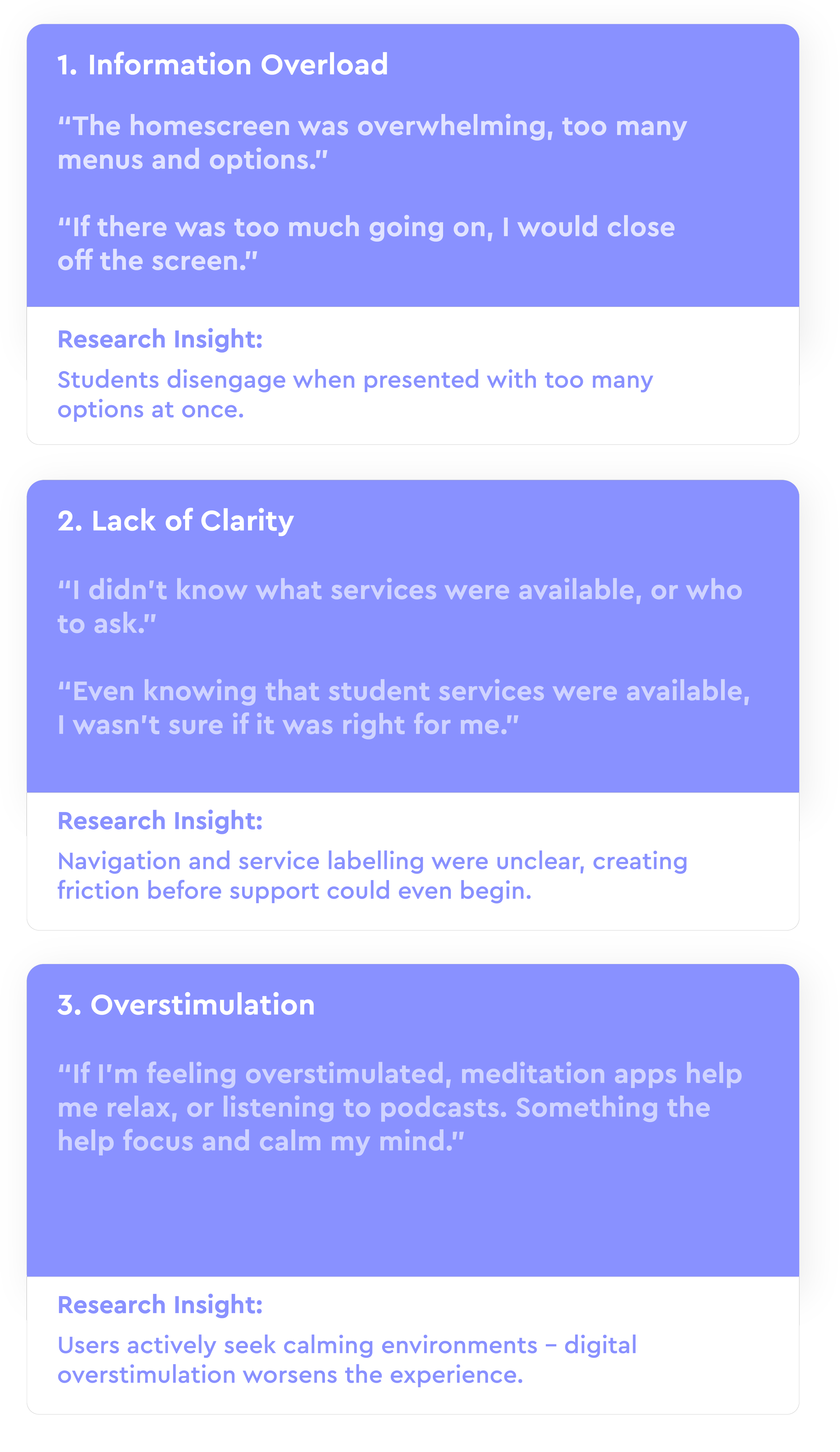
Usability Audit & Interaction Friction
Through heuristic evaluation and usability testing, three recurring patterns emerged: unclear affordances, navigational disorientation, and cognitive overload.
Each issue contributed to increased frustration and time-to-task for students with ADHD.
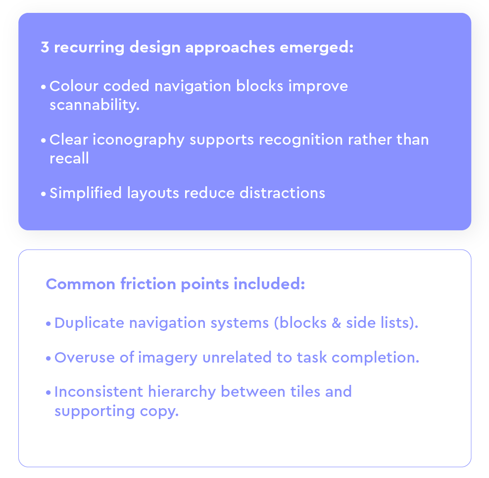
Competitor Analysis
To understand how other third-level institutions structure their Student Services sections, I reviewed comparable university websites to identify common patterns, strengths, and usability gaps.
The goal was to evaluate how navigation clarity, visual hierarchy, and content organisation were handled — particularly in relation to reducing cognitive load.
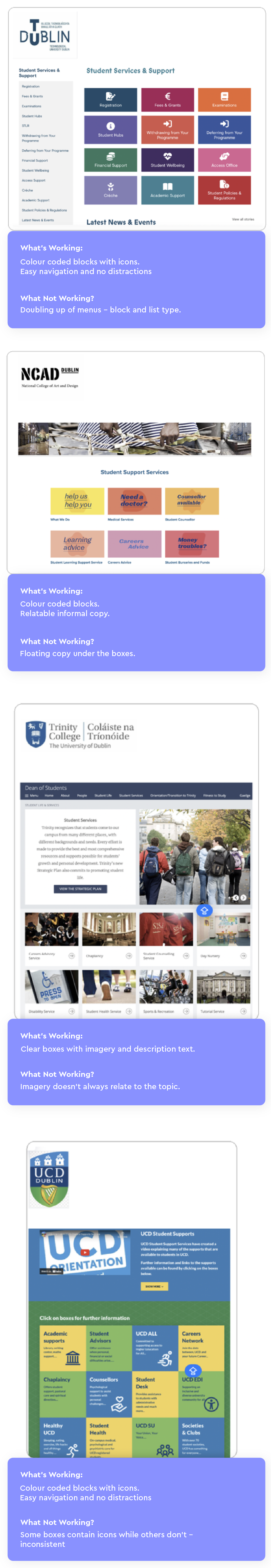
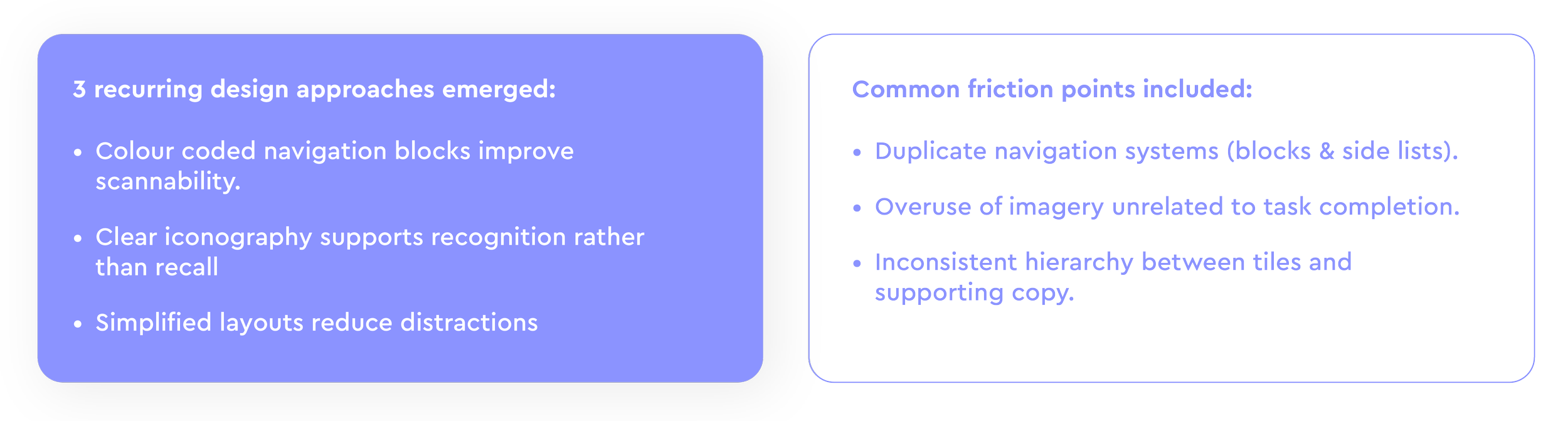
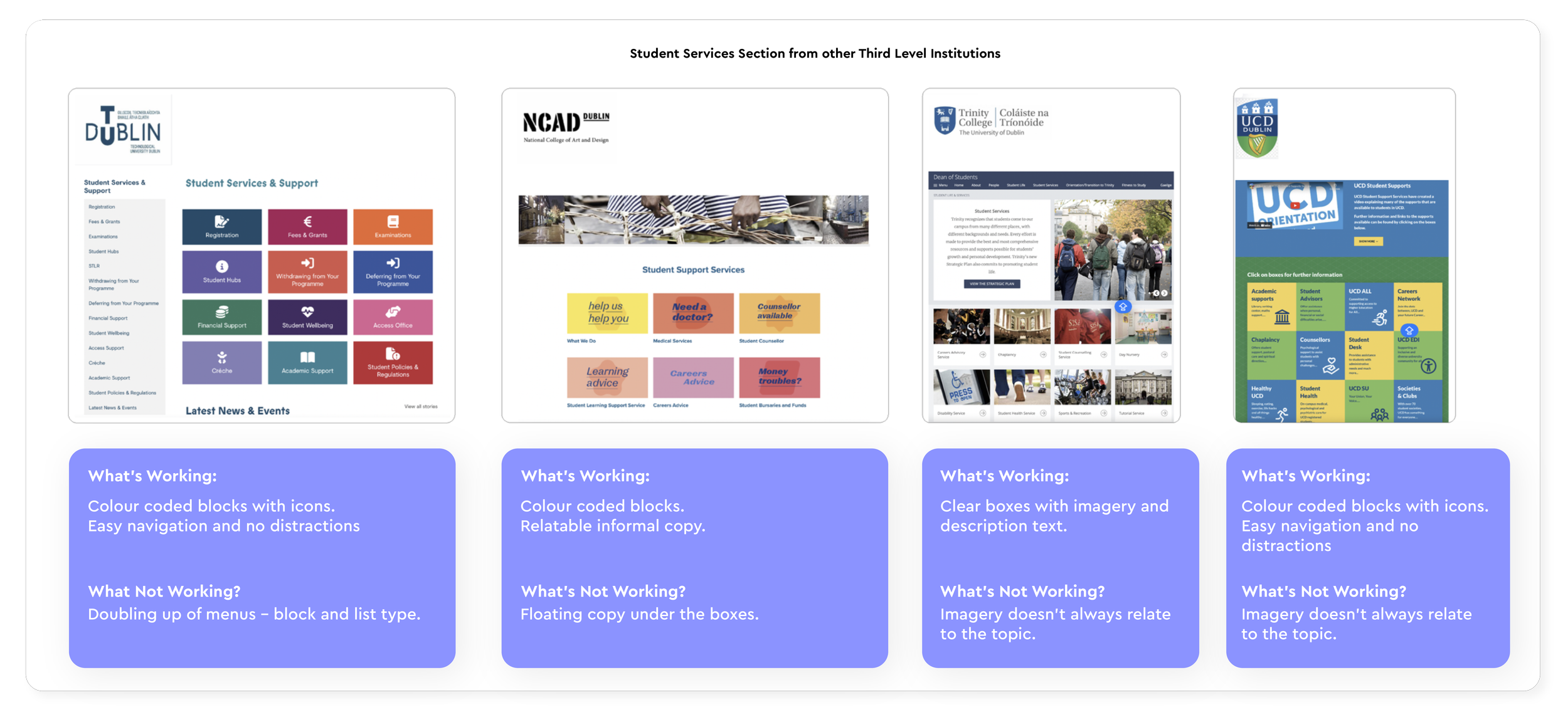
Common Patterns Identified
These insights informed the direction of the redesigned IA and interface,
making sure to prioritise clarity, consolidation, and task-focused navigation.
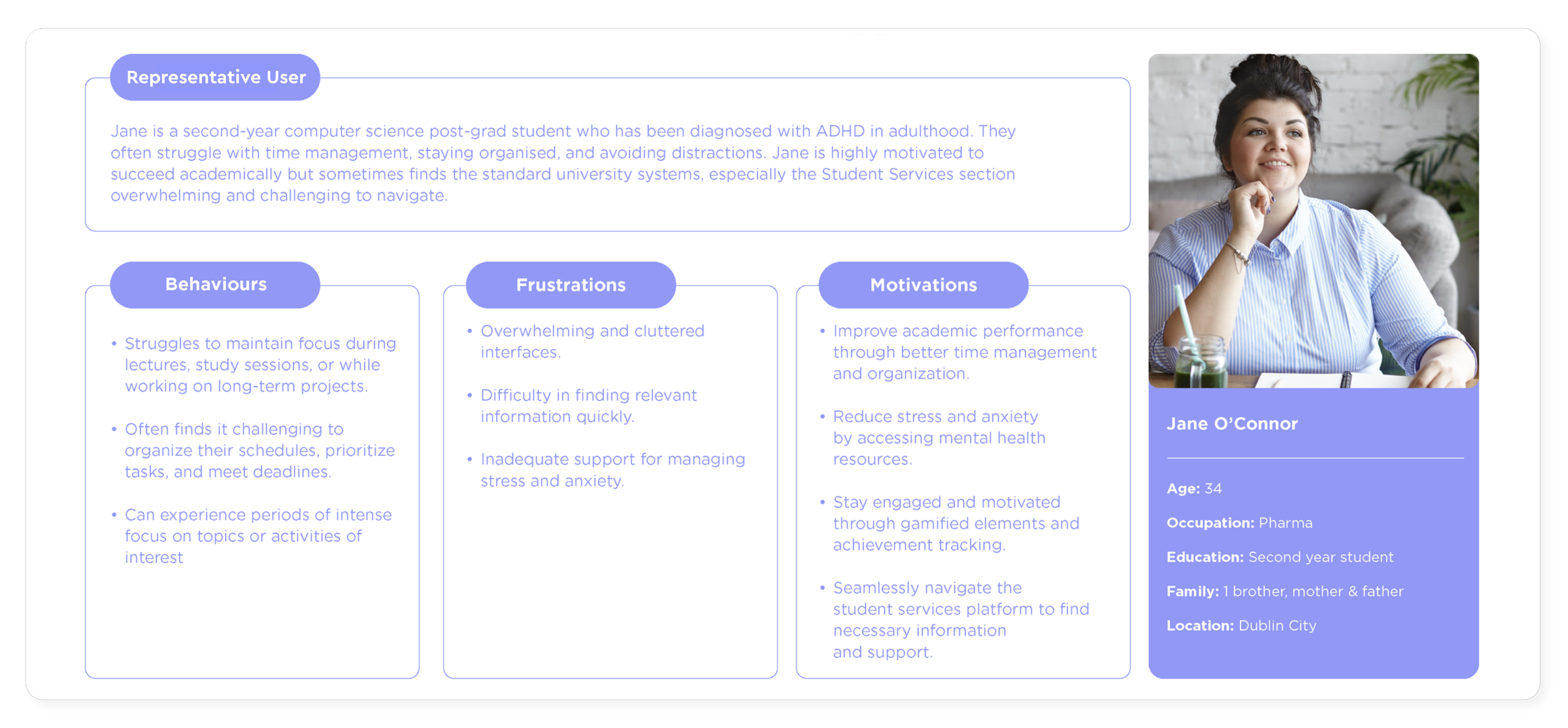
Designing for a Real User
To translate research insights into actionable design decisions, I created a representative persona reflecting the lived experiences of students with ADHD in third-level education.
Jane embodies the recurring frustrations identified in the research — particularly cognitive overload, navigation difficulty, and stress management — helping ensure the redesign remained empathetic and user-centred.
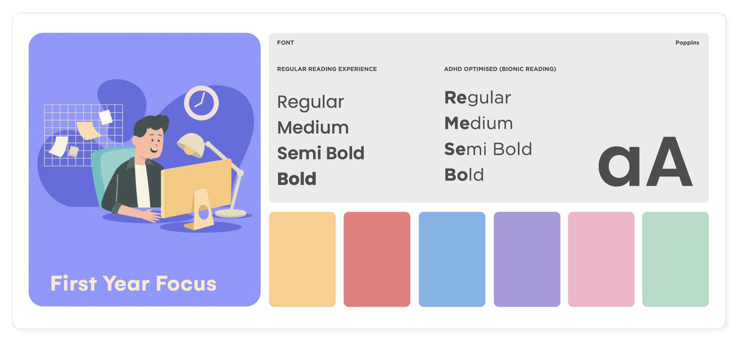
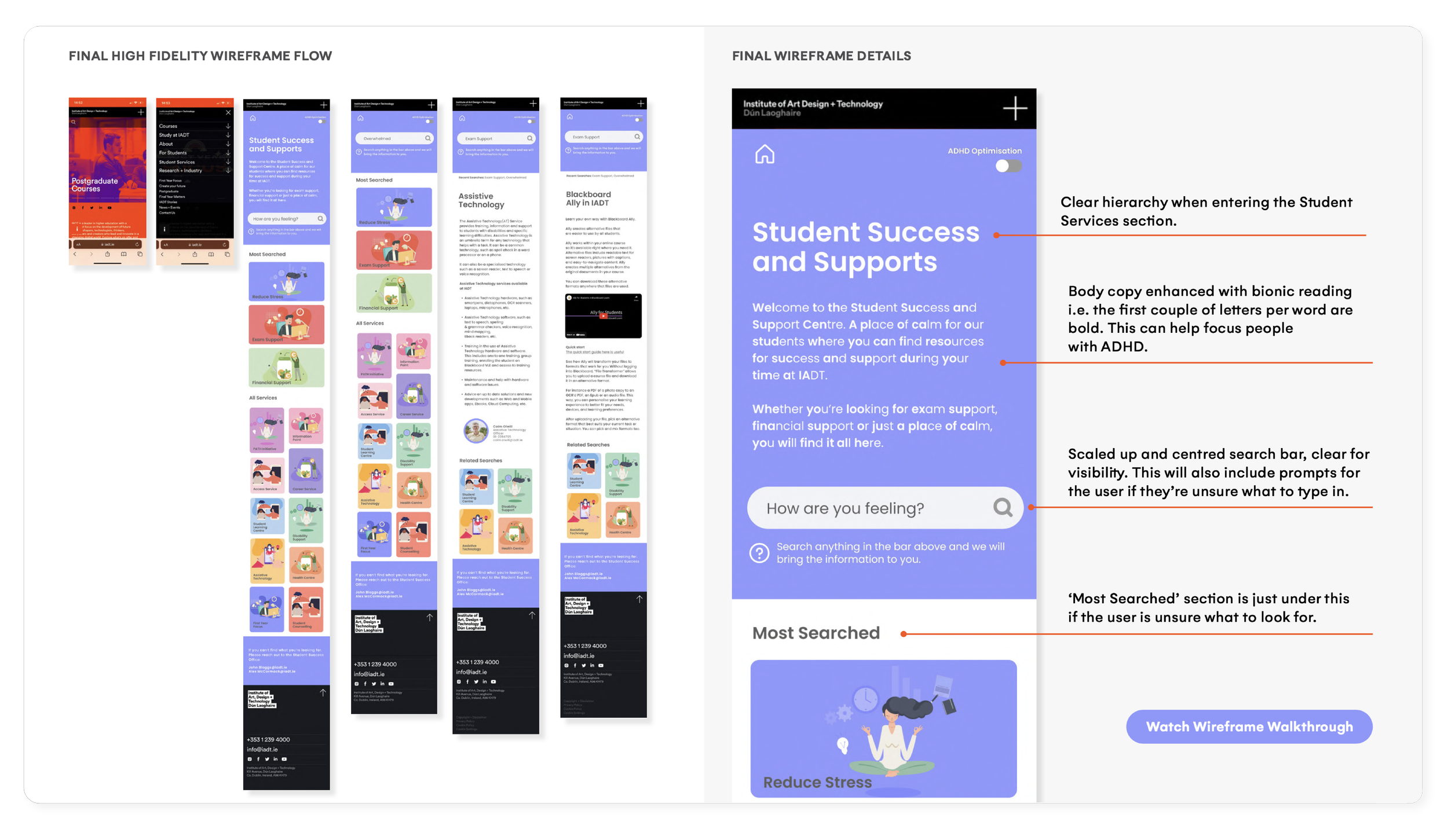
Visual Design & Accessibility Considerations
Research findings highlighted that students with ADHD often experience overwhelm when presented with dense layouts, high visual contrast, and competing colour hierarchies.
The visual direction focused on creating a calmer, low-friction interface through a restrained colour palette, clear typography, and reduced visual noise.
Design decisions prioritised cognitive ease, readability, and focus.
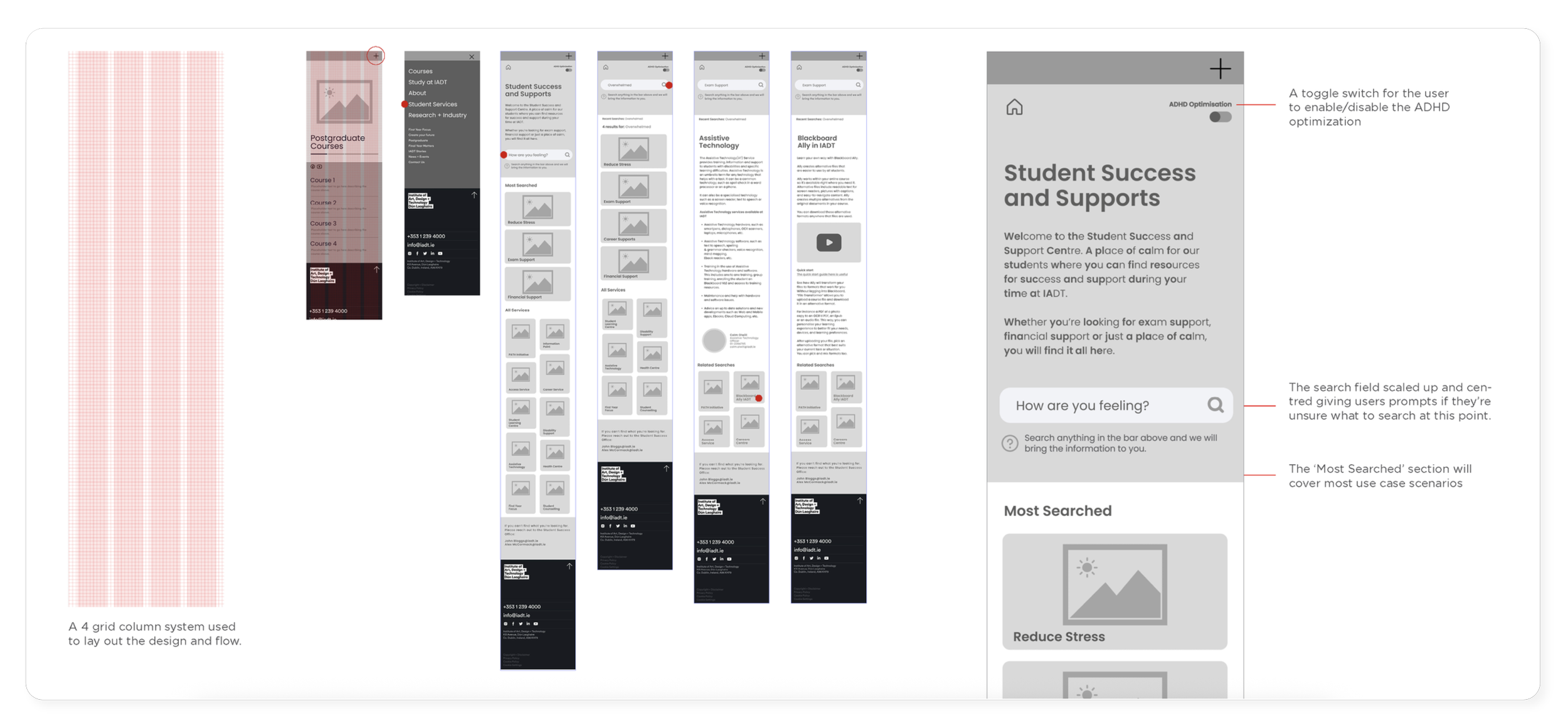
Low Fidelity Mobile Wireframe
Research findings highlighted that students with ADHD often experience overwhelm when presented with dense layouts, high visual contrast, and competing colour hierarchies.
The visual direction focused on creating a calmer, low-friction interface through a restrained colour palette, clear typography, and reduced visual noise.
Design decisions prioritised cognitive ease, readability, and focus.
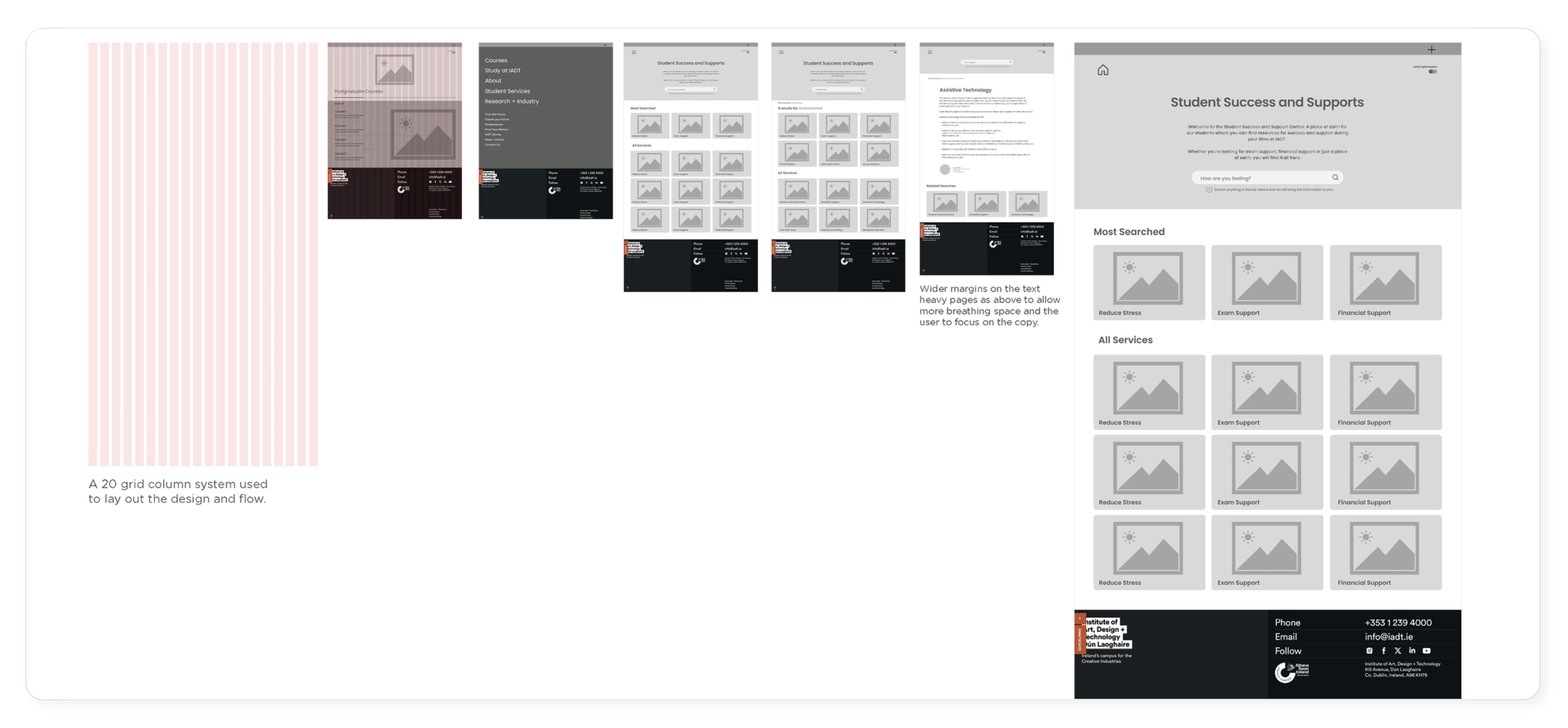
Low Fidelity Desktop Wireframe
Research findings highlighted that students with ADHD often experience overwhelm when presented with dense layouts, high visual contrast, and competing colour hierarchies.
The visual direction focused on creating a calmer, low-friction interface through a restrained colour palette, clear typography, and reduced visual noise.
Design decisions prioritised cognitive ease, readability, and focus.
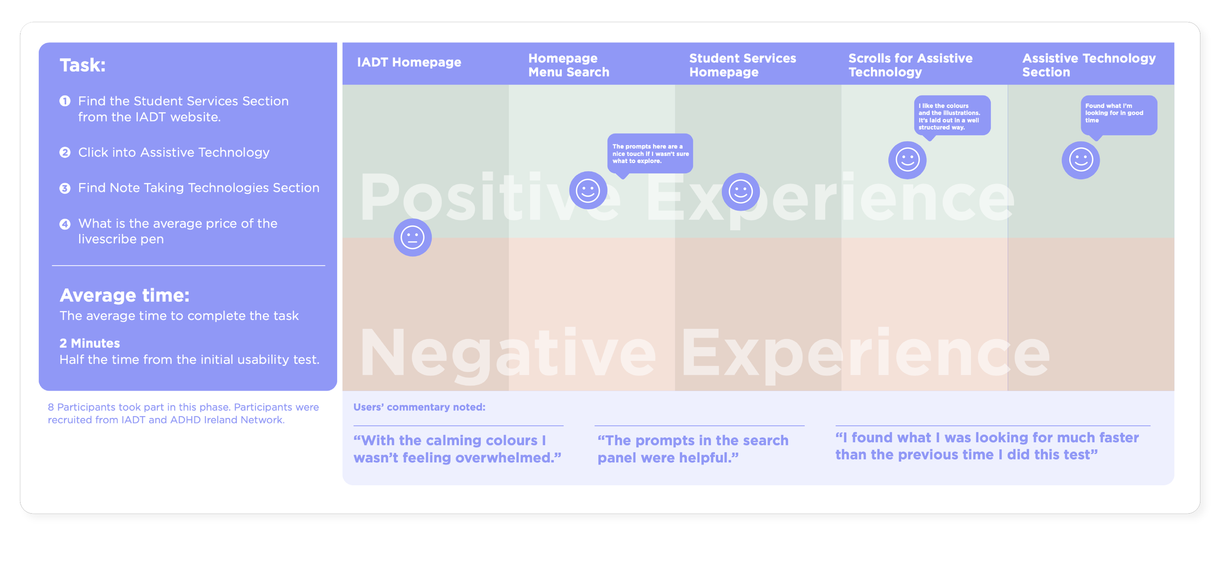
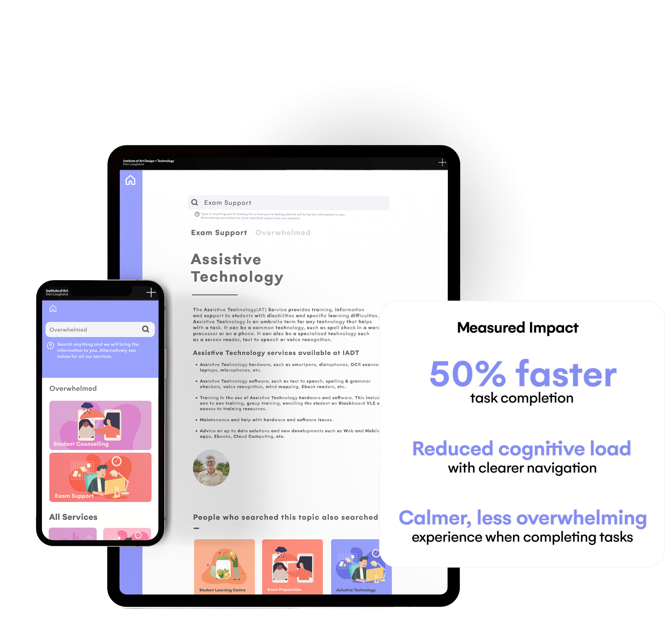
Final Usability Test
Research findings highlighted that students with ADHD often experience overwhelm when presented with dense layouts, high visual contrast, and competing colour hierarchies.
The visual direction focused on creating a calmer, low-friction interface through a restrained colour palette, clear typography, and reduced visual noise.
Design decisions prioritised cognitive ease, readability, and focus.