Offset Connect – UX Research & Product Design
Carbon offsetting is widely offered at checkouts, but poor UX and low trust mean users rarely adopt it. So I researched why — and redesigned the experience to fix it.
UX Research · UI Design · Content Strategy · 2023–2024 · MSc Project
Research & Key Insights
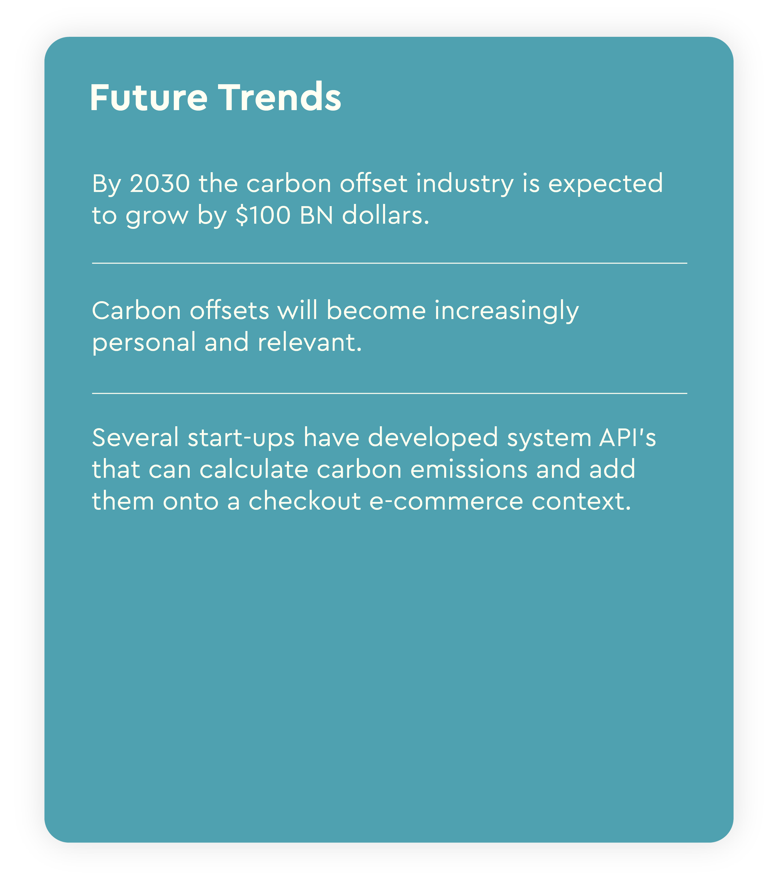
Future trends surrounding Carbon Offsetting
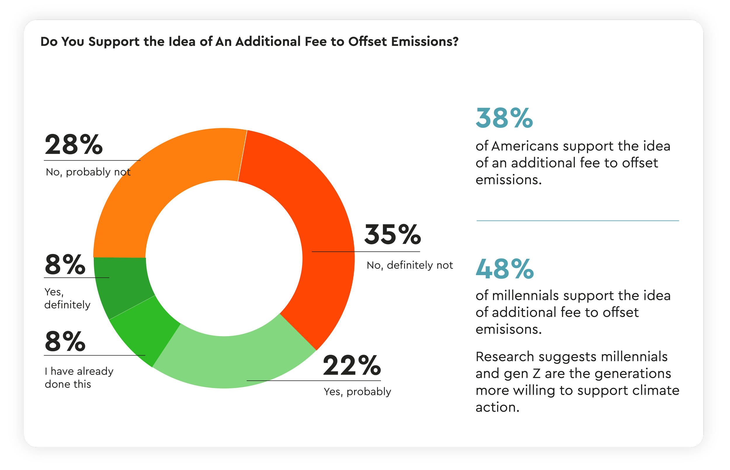
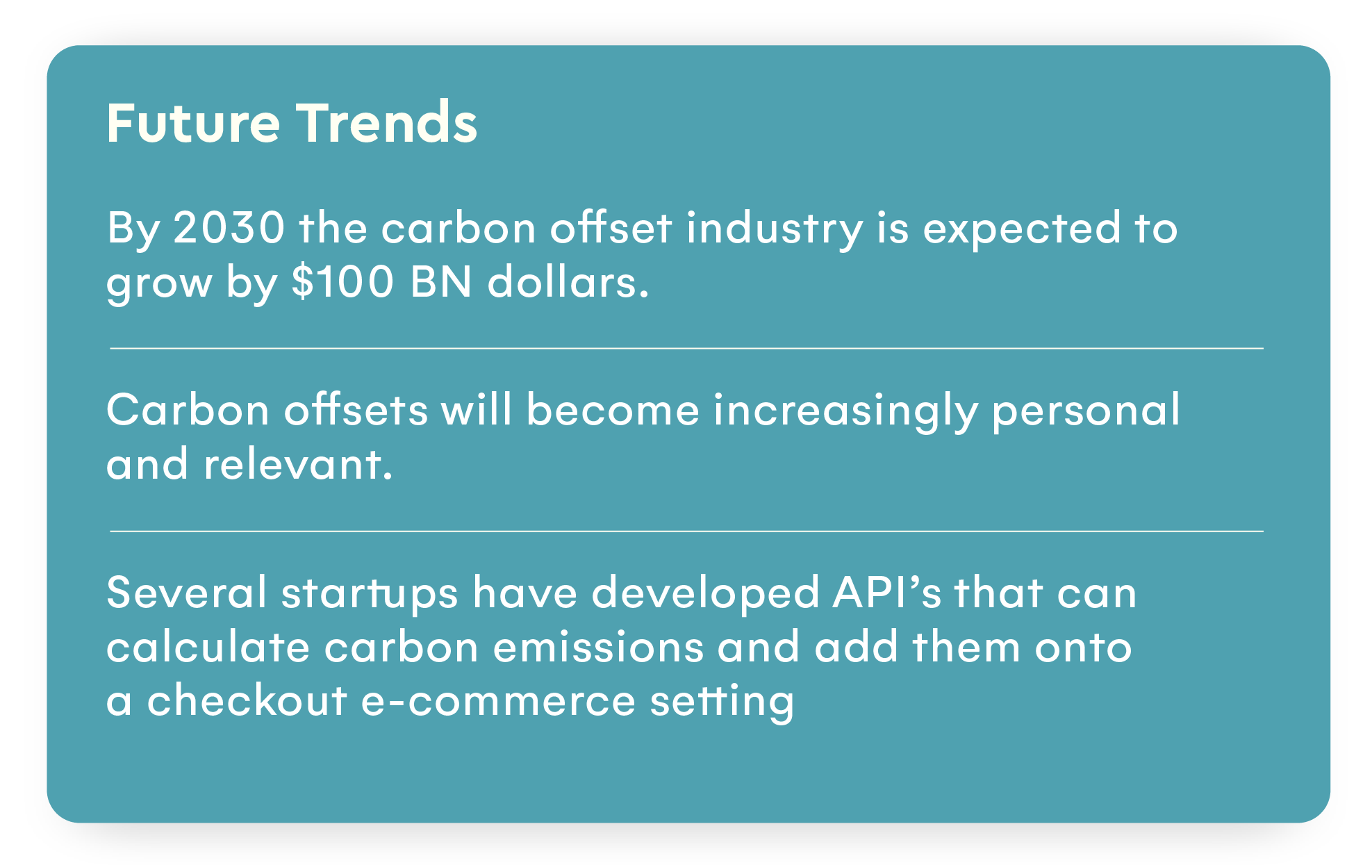
Research indicates that the carbon offset industry is poised for significant growth, with projections estimating its value to reach $100 billion by 2030. Younger generations particularly millennial's and Gen Z, are increasingly concerned with environmental and climate action. As illustrated in the accompanying graph, 48% of millennial's support the concept of an additional fee to offset emissions, a sentiment that is also expected to be prevalent among Gen Z
Competitor Analysis
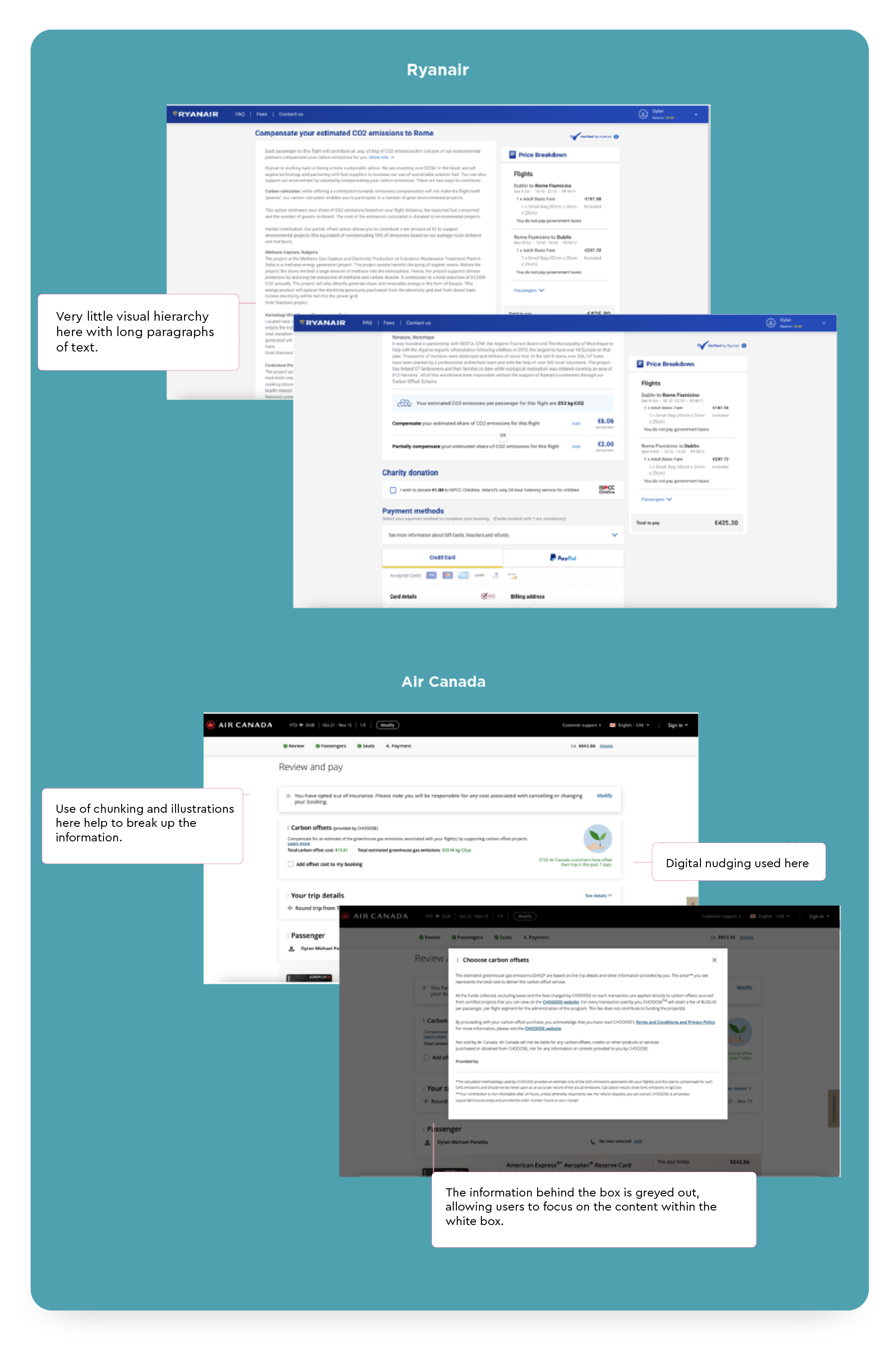
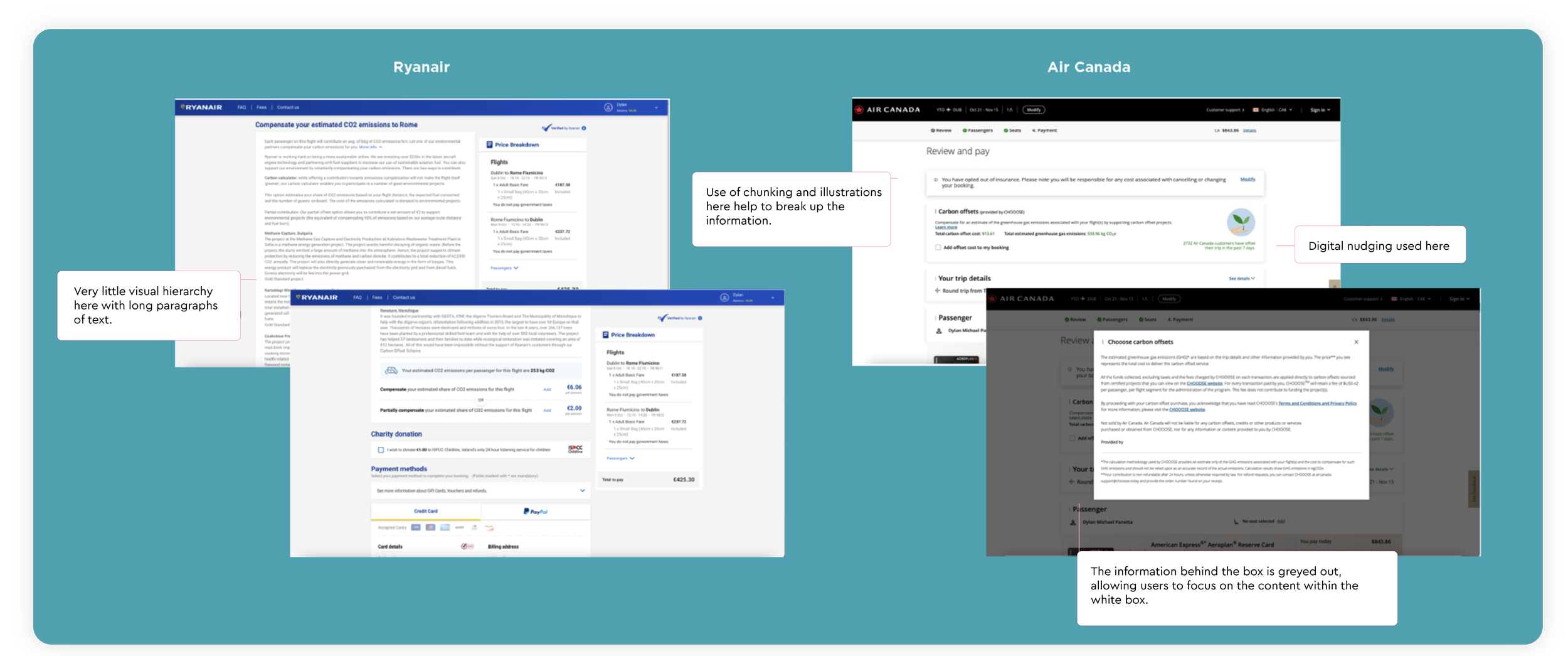
Ryanair
Heavy use of long-form text with limited visual hierarchy
Low scanability increases cognitive load at checkout
Carbon offset option is easy to overlook and deprioritize
Lacks visual cues to support quick decision-making
Air Canada
Information is chunked into digestible sections, improving clarity
Uses modal overlay + background dimming to focus user attention
Applies subtle nudging (e.g. defaults, emphasis) to encourage uptake
Clearer structure supports faster comprehension and action
Key Takeaways
Strong visual hierarchy increases visibility of optional features
Reducing cognitive effort is critical in high-friction checkout stages
Attention design (modals, contrast) helps isolate key decisions
Behavioral nudges can increase adoption without disrupting flow
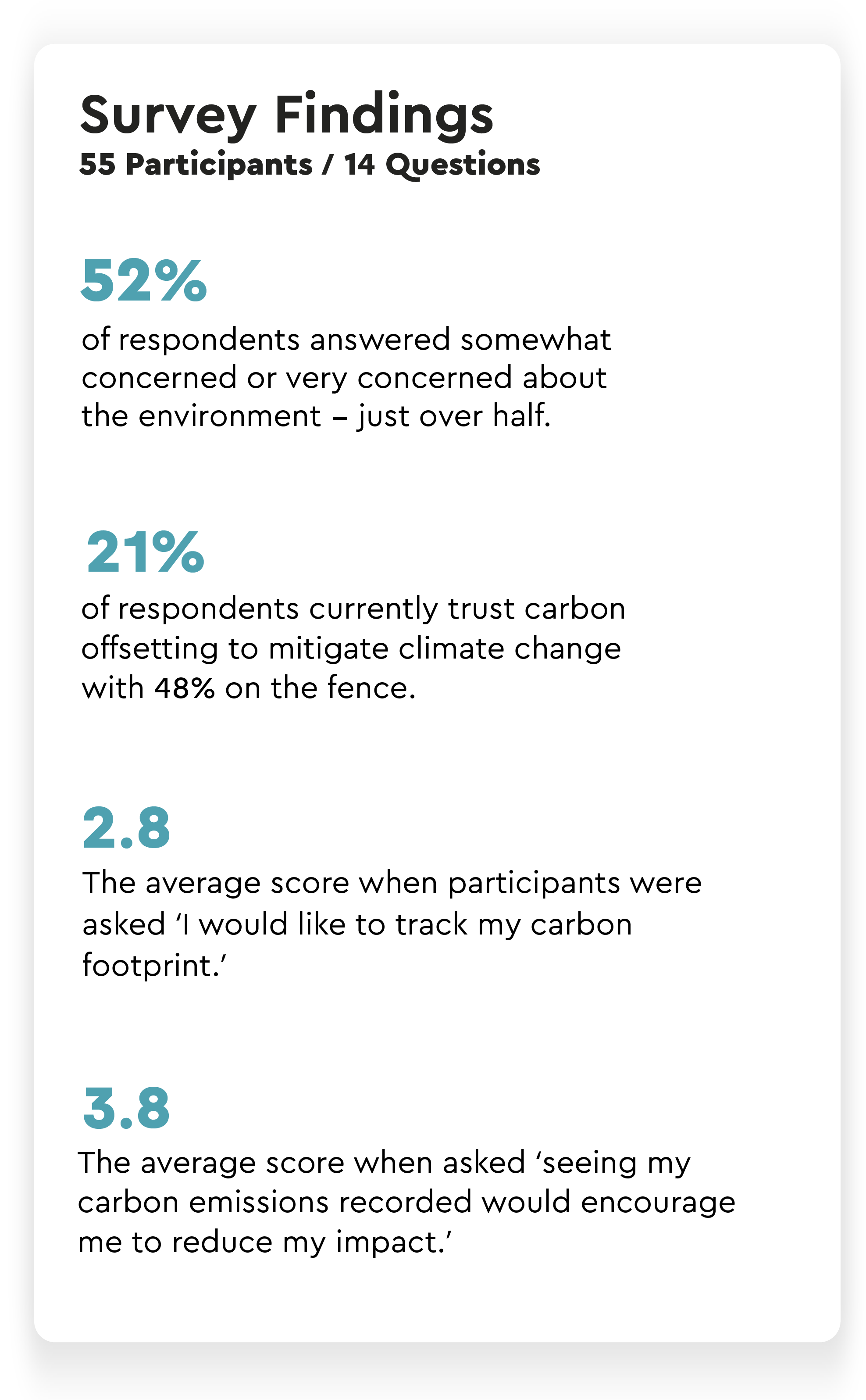
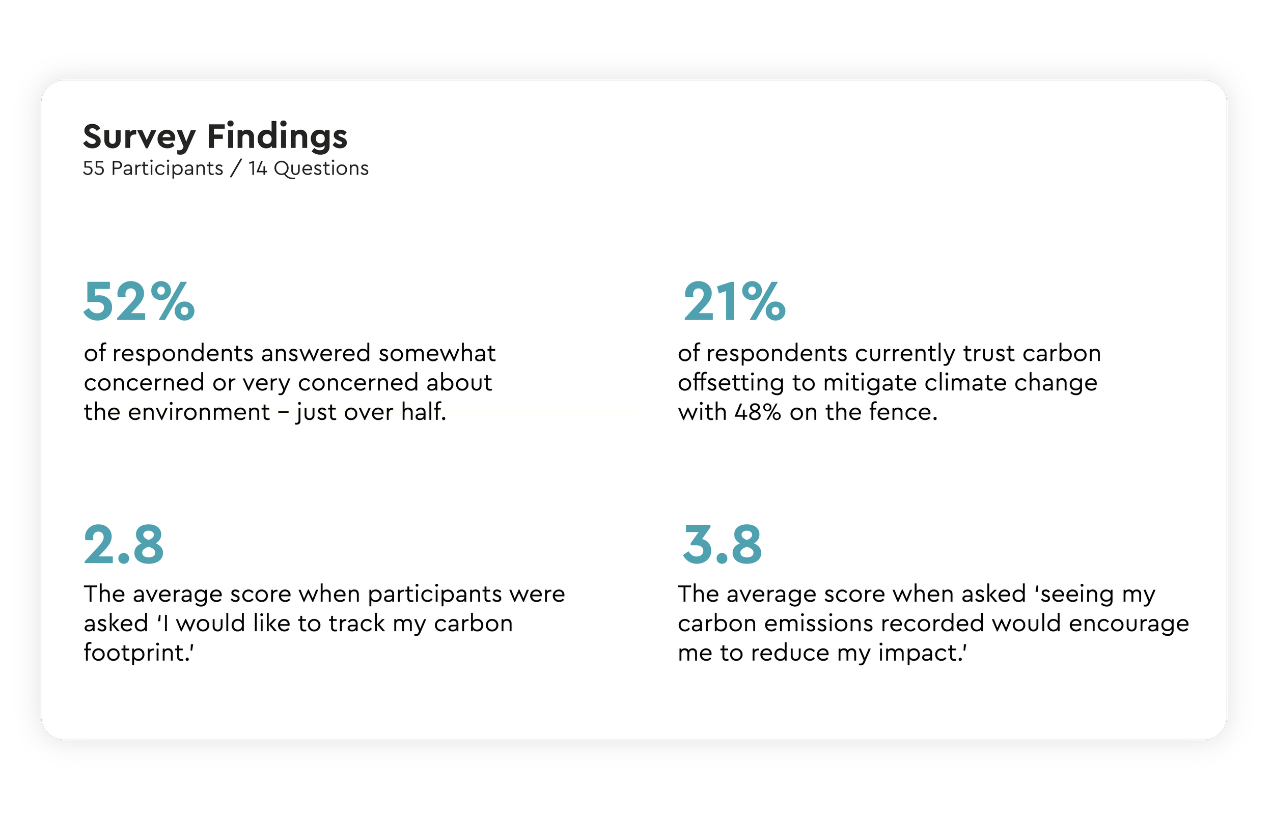
Survey Findings
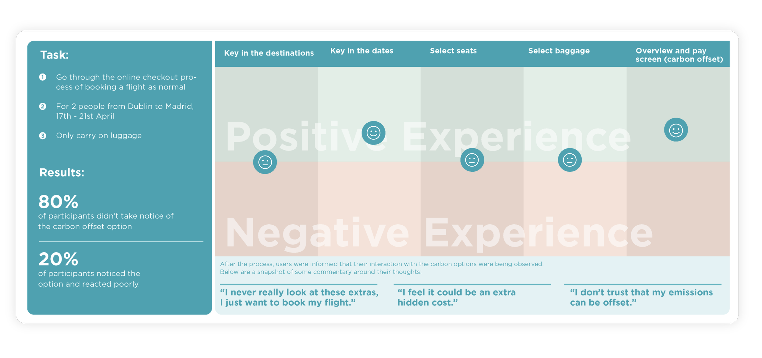
Usability Testing & Results
Analysing the Results
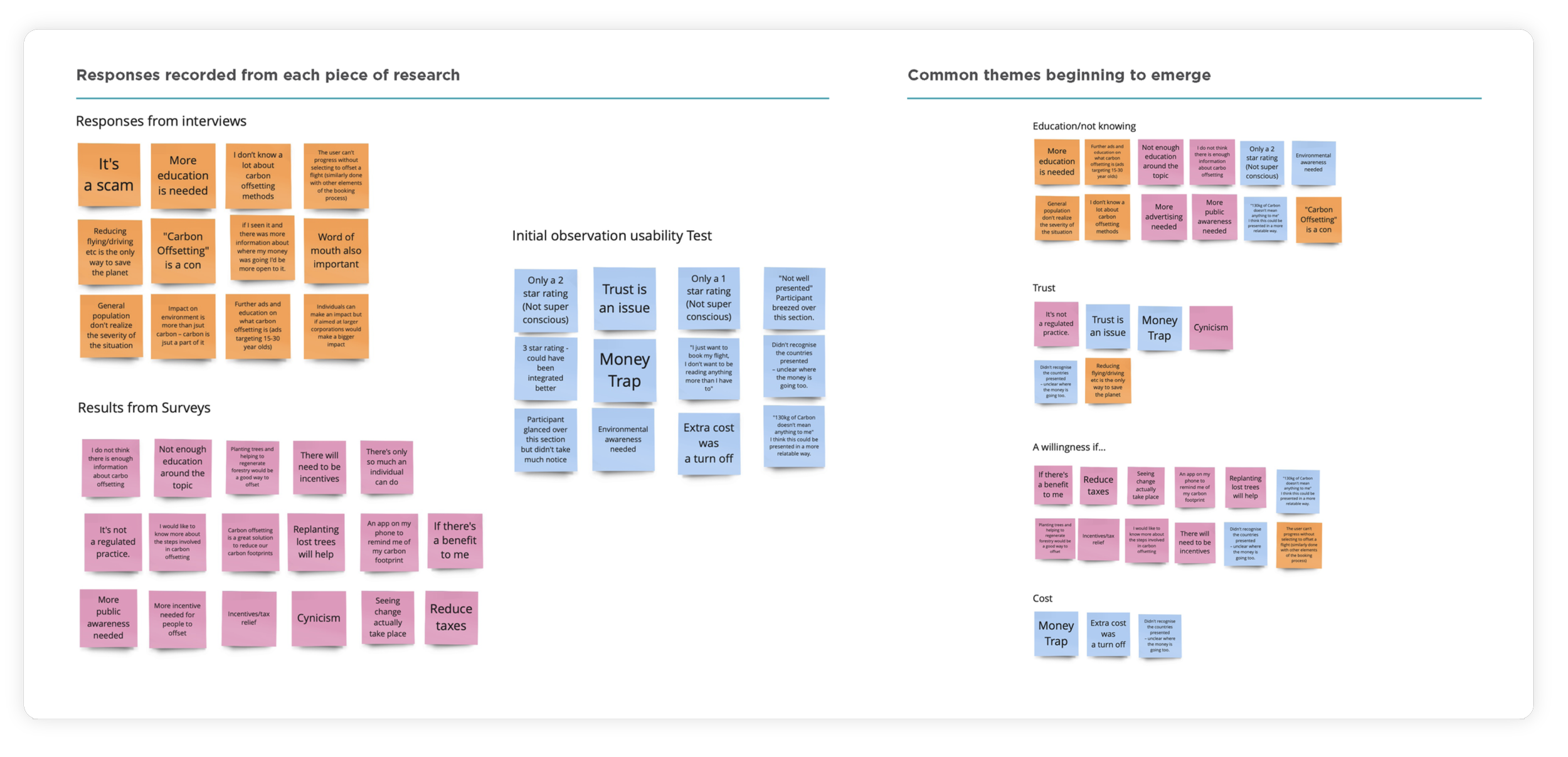
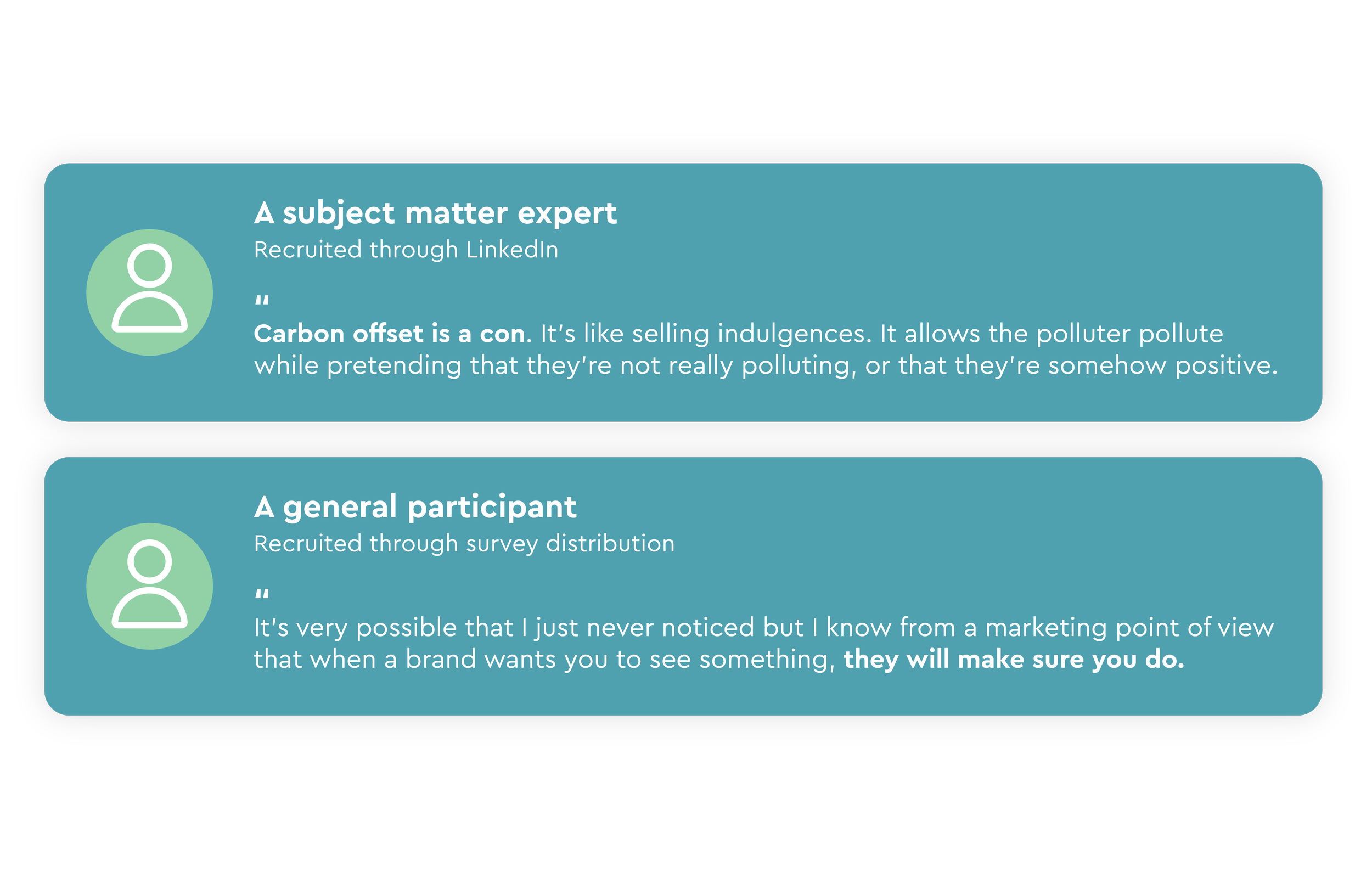
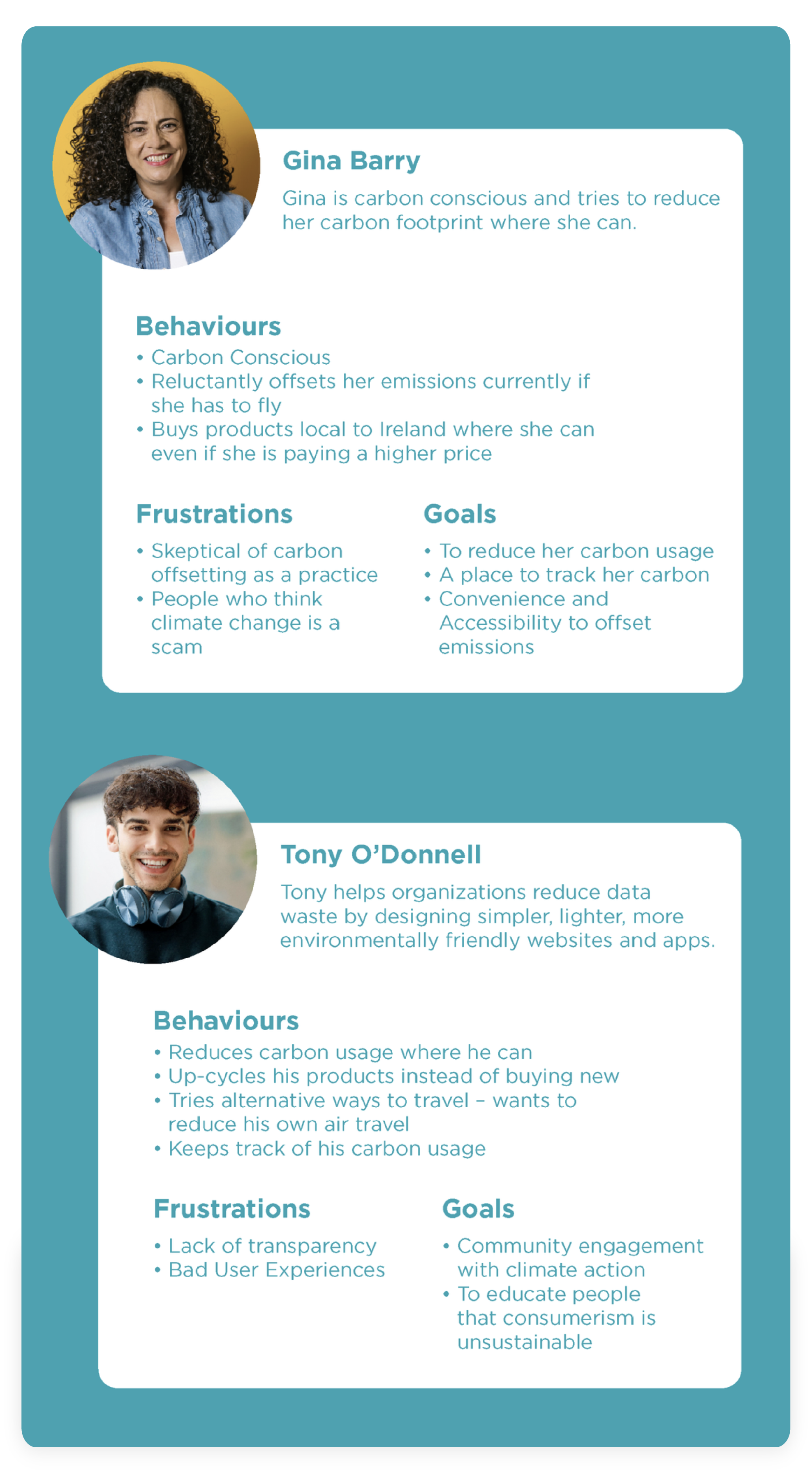
Key User Types
Synthesised from interviews, surveys, and usability tests to guide design decisions.
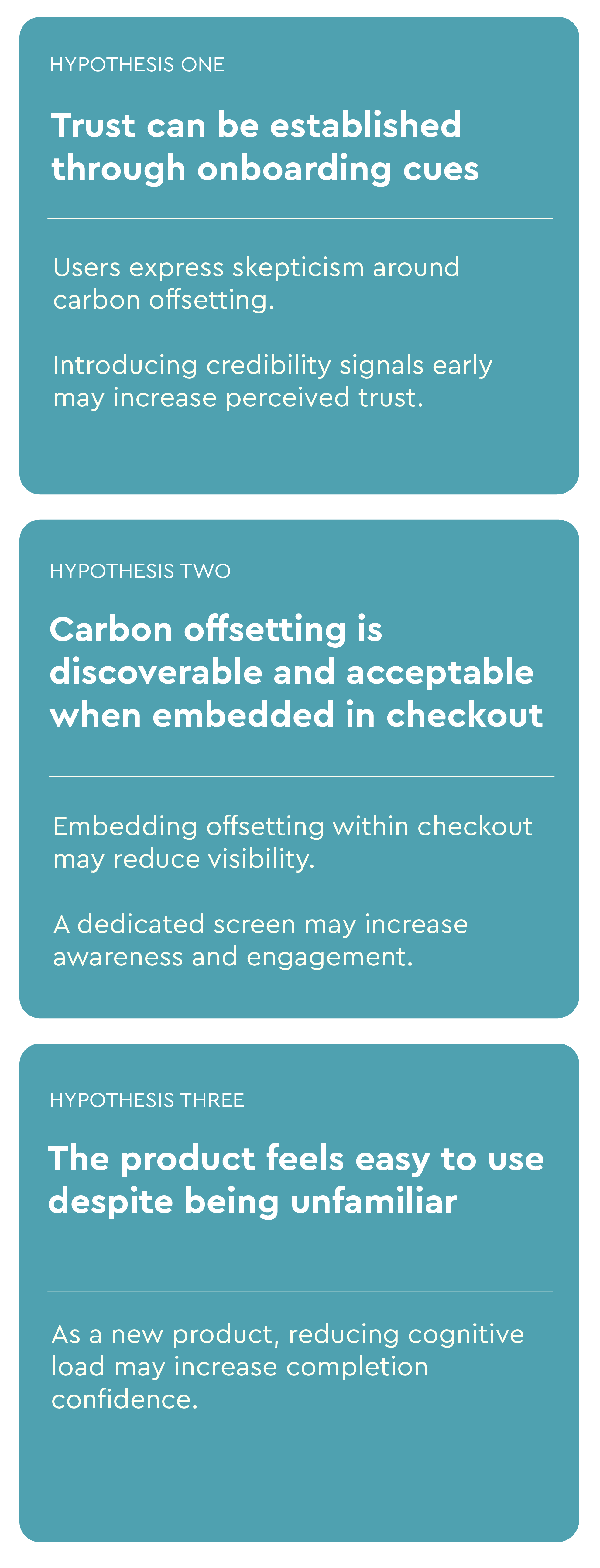
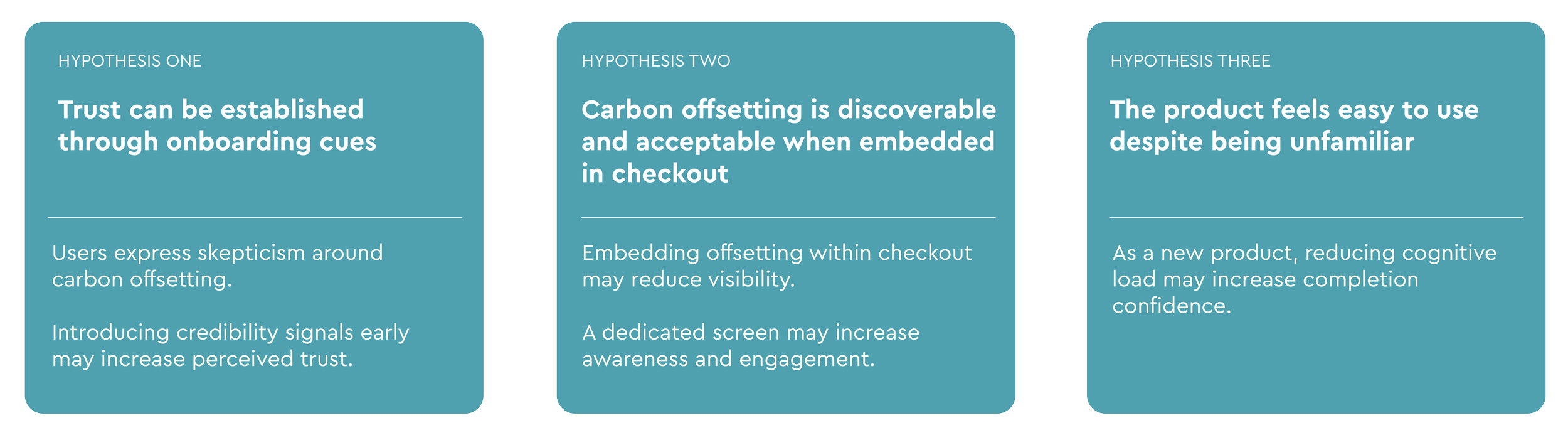
Exploratory Design Hypotheses
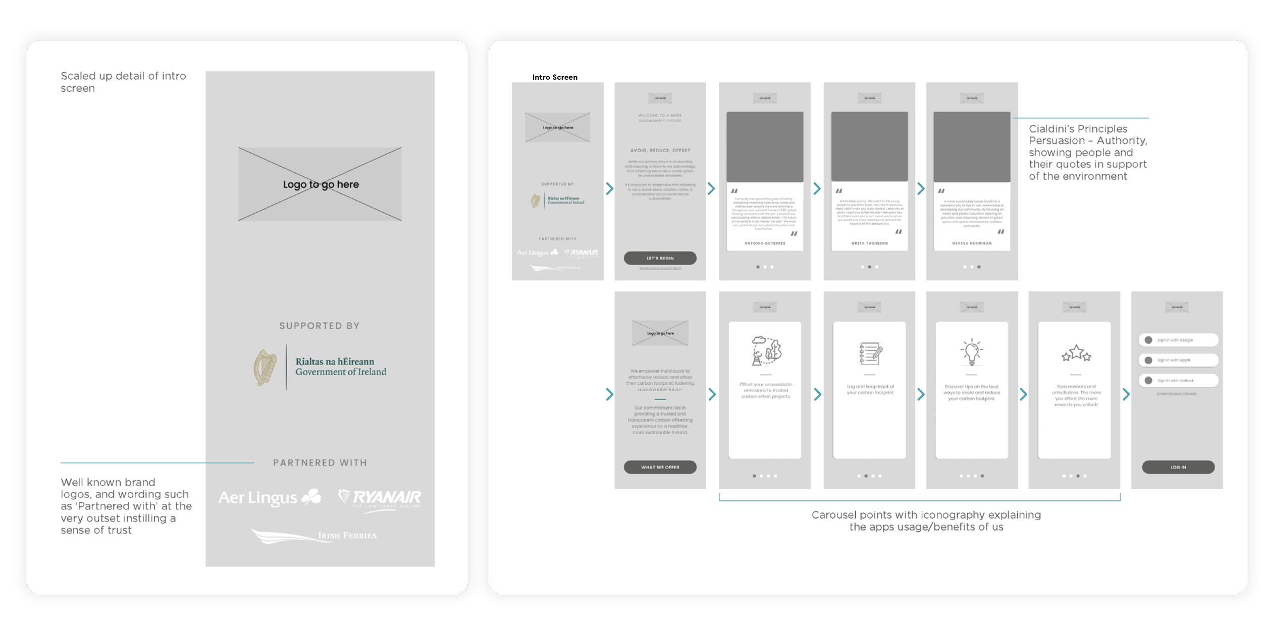
To understand how users might first encounter and evaluate the product, three distinct flows were explored, each testing a different assumption around trust, discoverability, and ease of use.
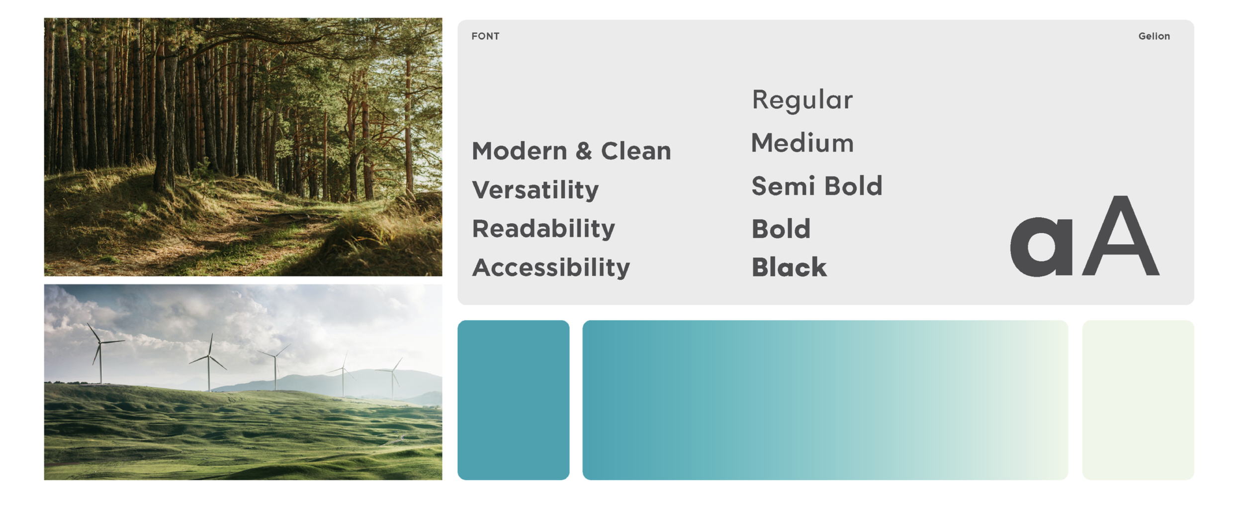
Visual Style
Flow 1:
Establishing Trust During First-Time Use
Hypothesis:
Trust signals introduced early in onboarding will increase perceived credibility for a first-time user in a sustainability context.
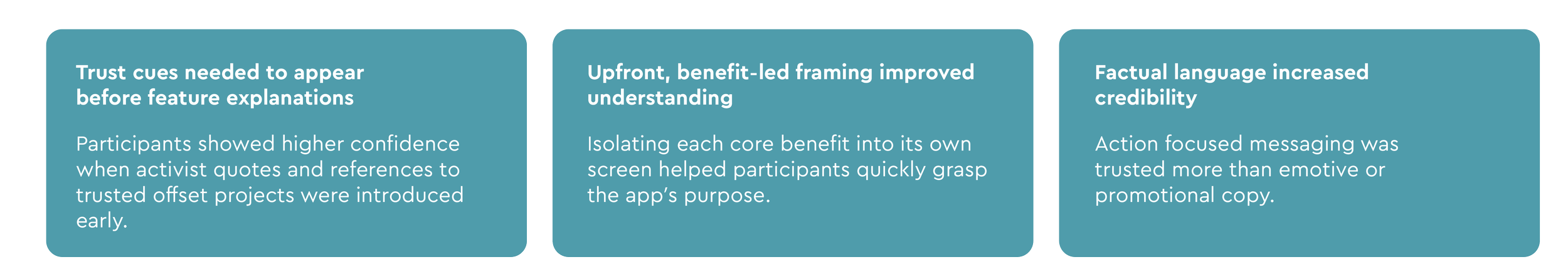
Flow 1 Findings (Usability Testing)
Flow 2:
Discoverability within a Checkout Experience (usability testing)
Hypothesis
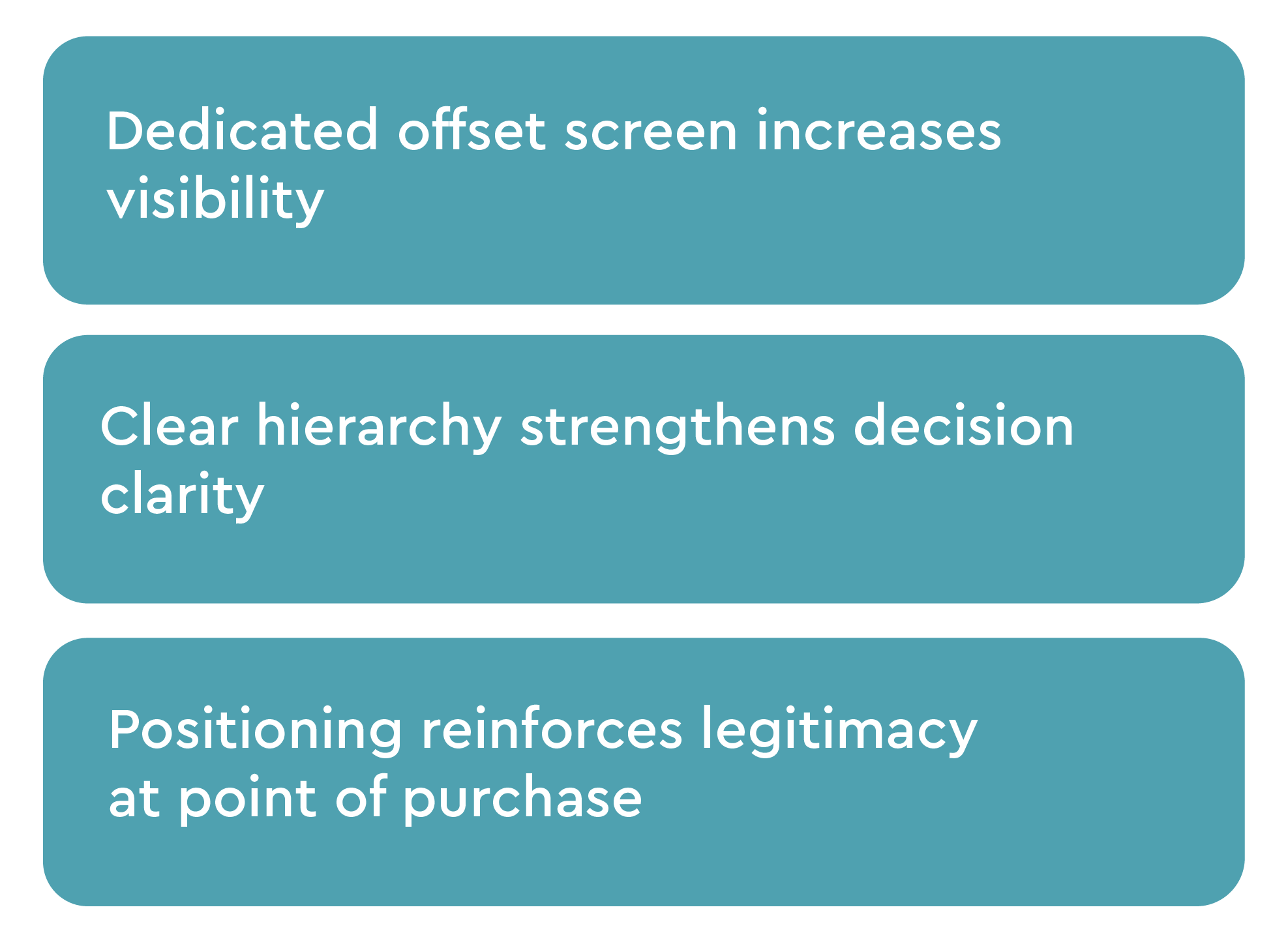
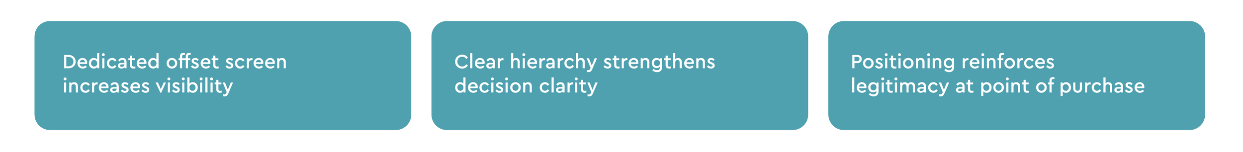
Embedding carbon offsetting within an existing checkout flow may reduce friction, but risks being overlooked compared to a dedicated screen.
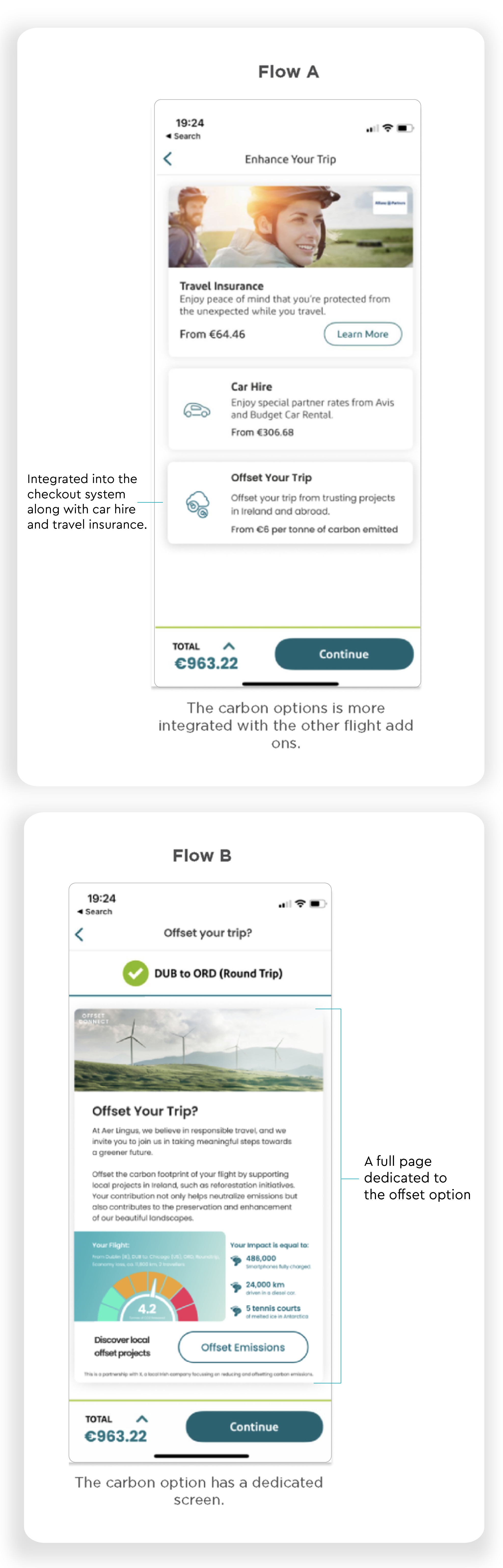
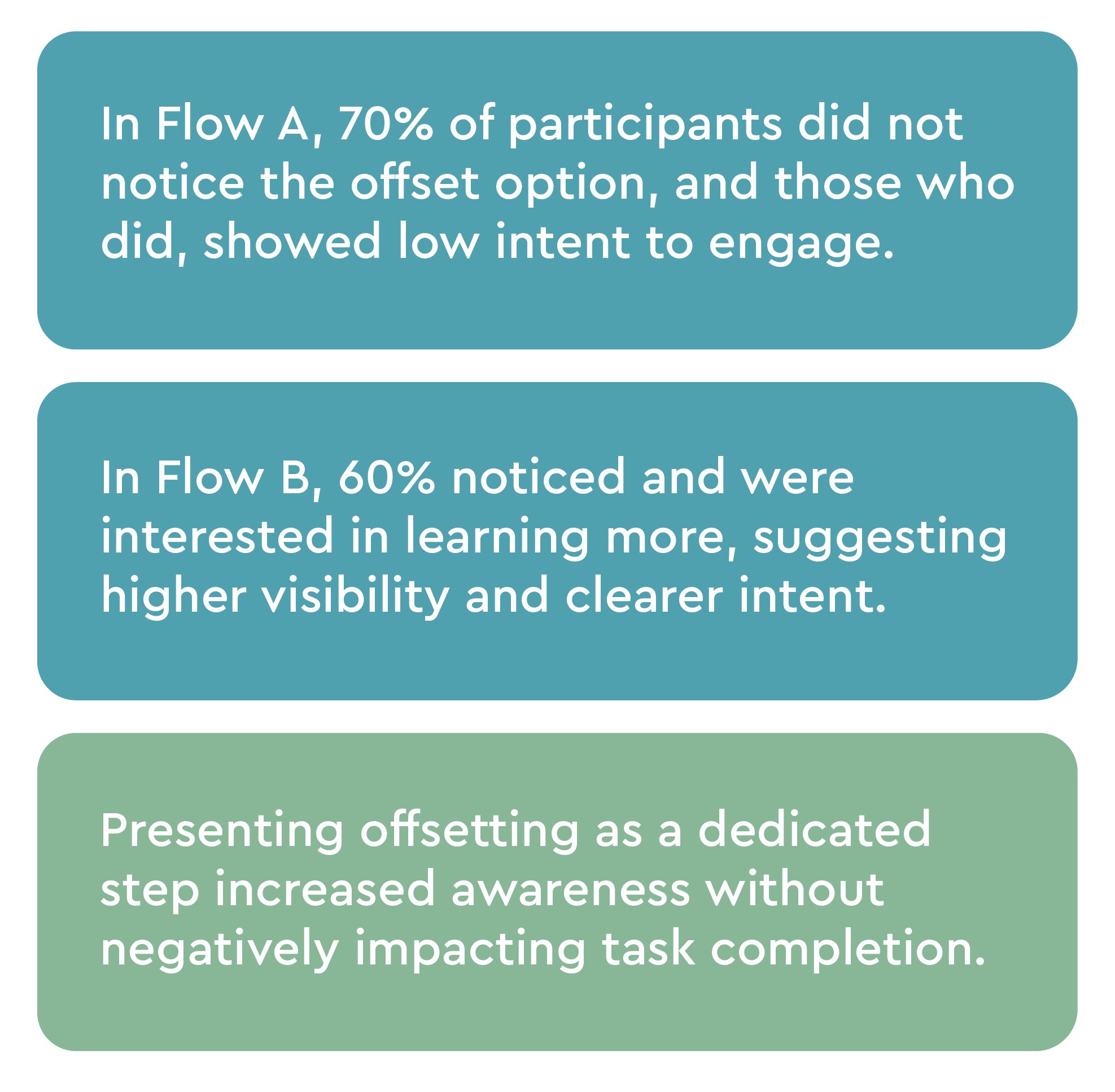
Flow 2 Findings (A/B testing)
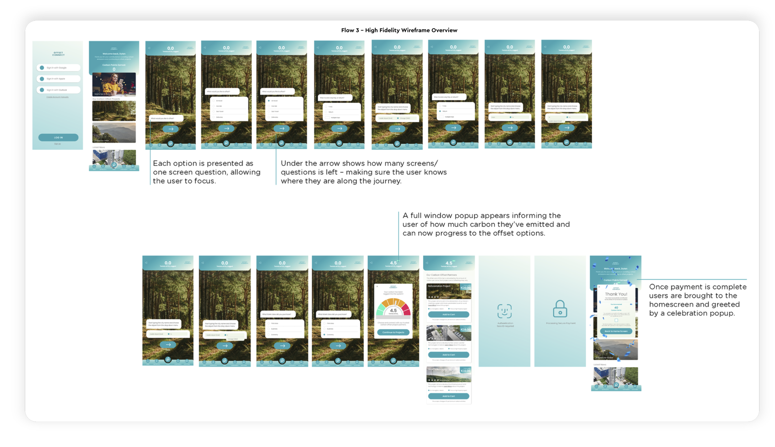
Flow 3:
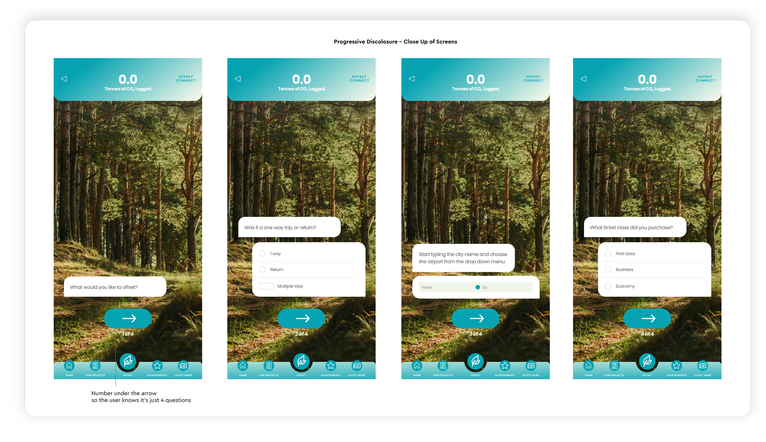
Ease of Use offsetting manually within the app (usability testing)
Hypothesis
The product feels easy to use, despite being unfamiliar and new to the market.
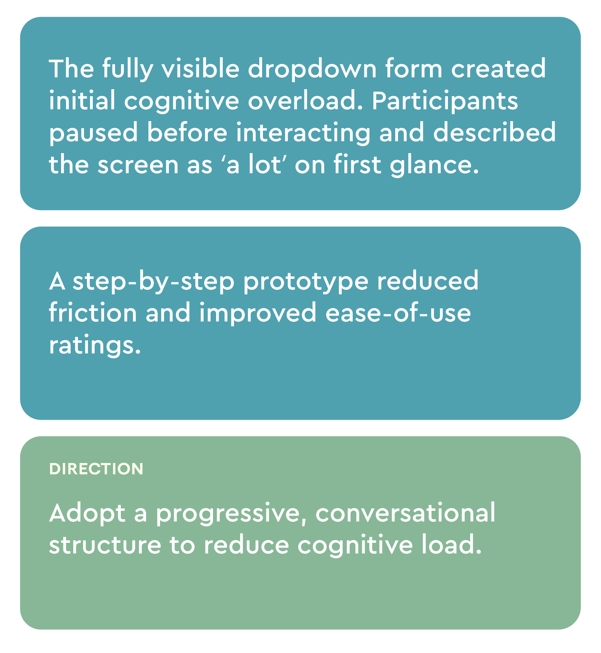
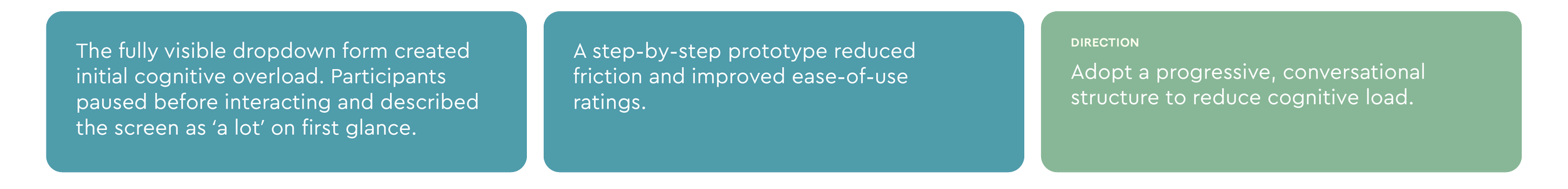
Flow 3 Findings (ease of use survey & usability testing)
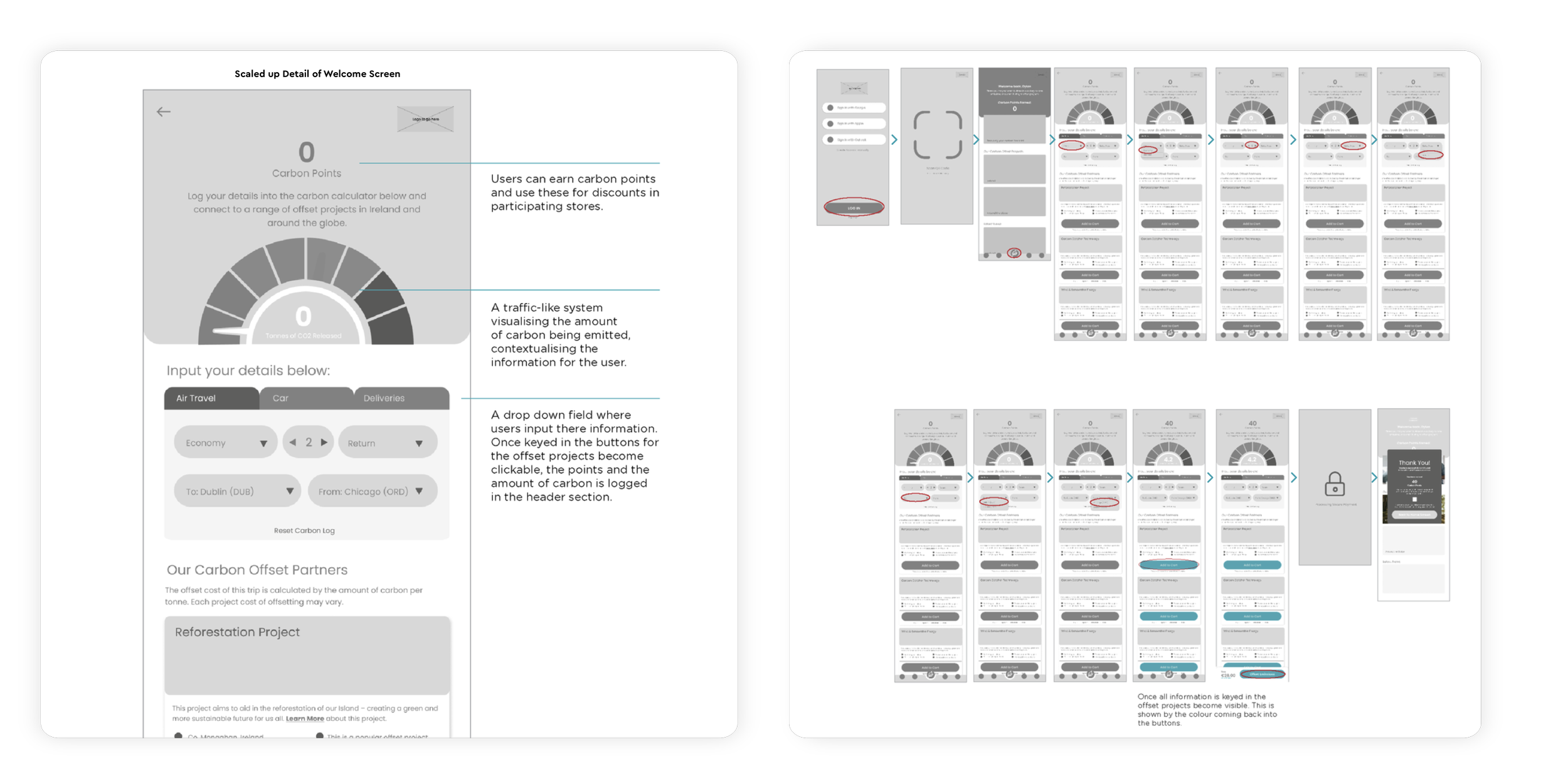
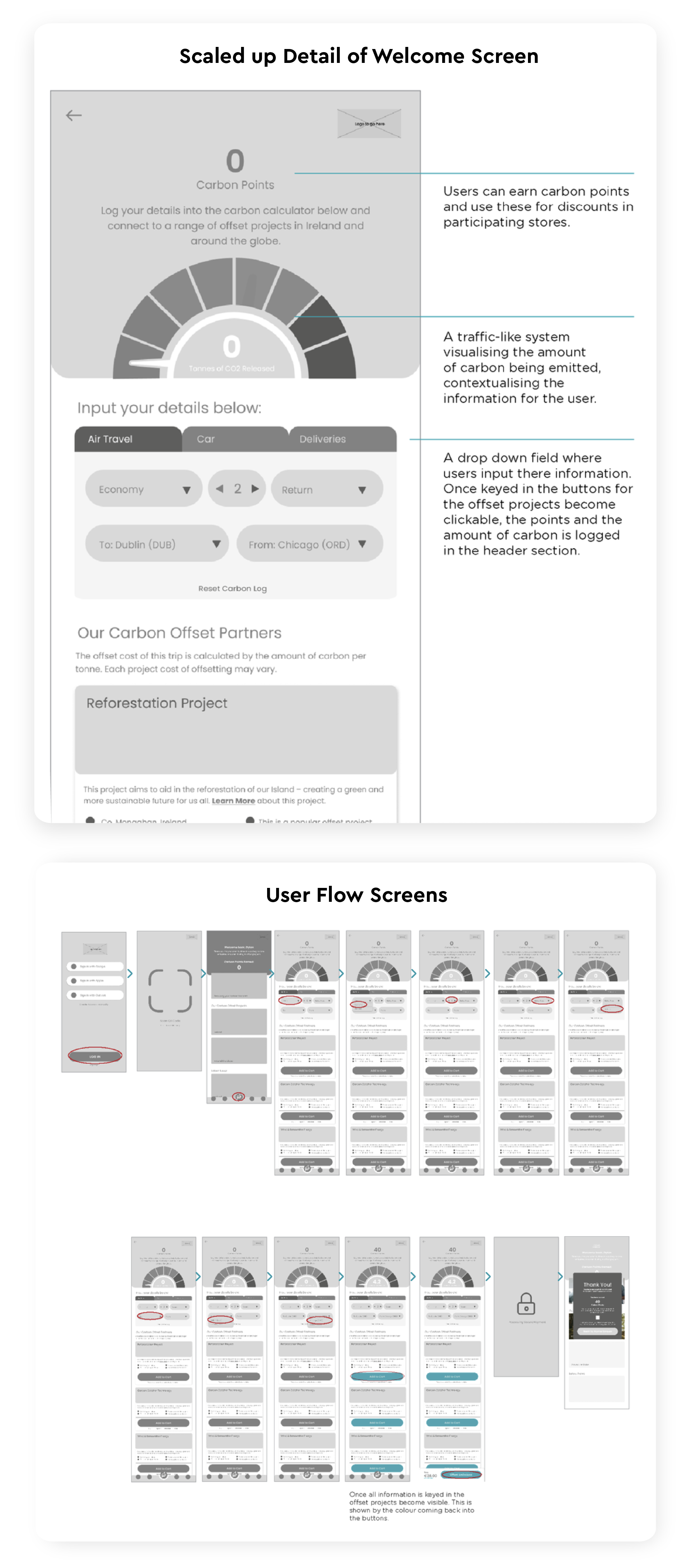
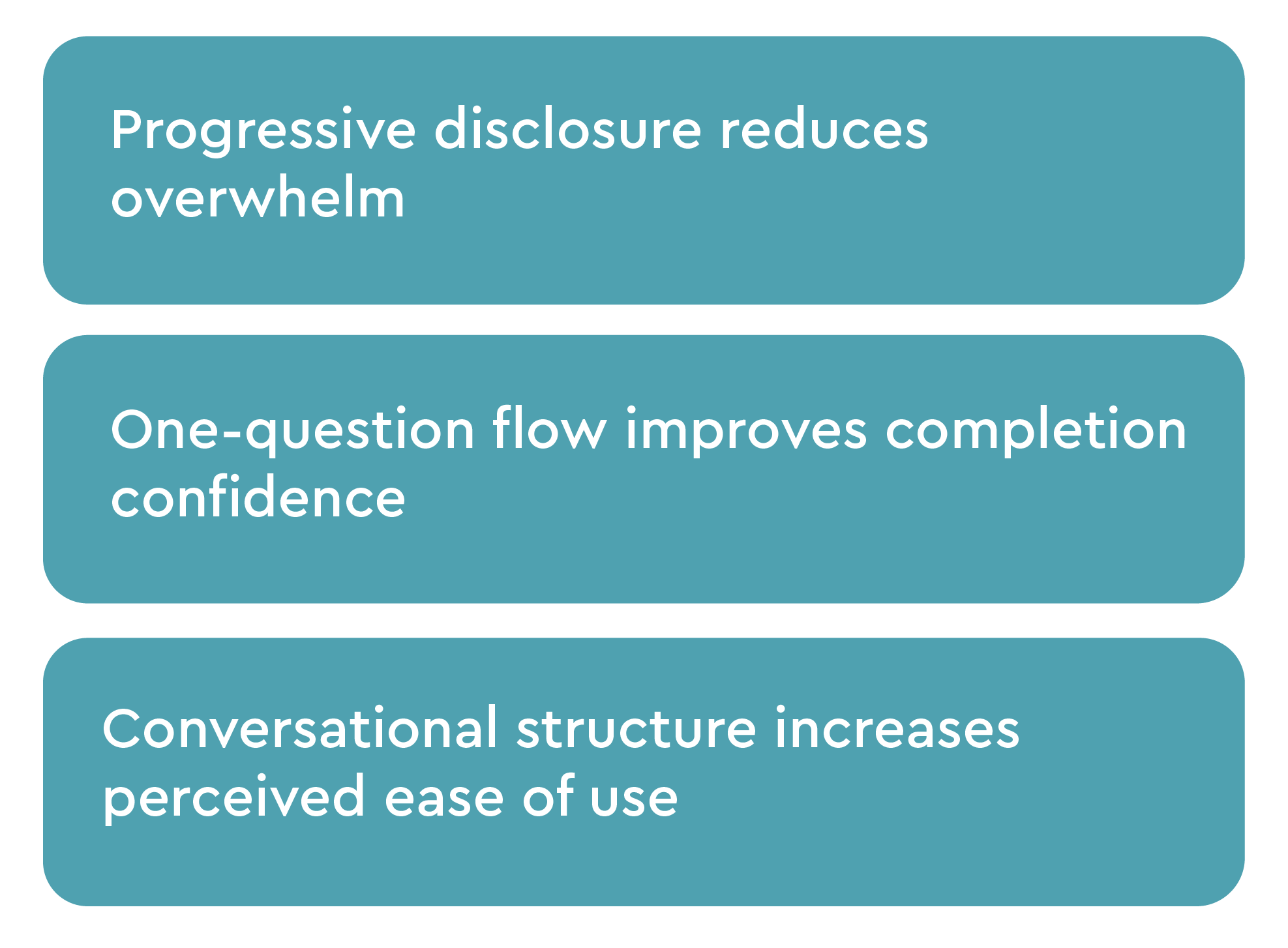
Final Product Direction
Integrating validated decisions from usability testing & surveys
The final experience synthesises learnings from three usability tests. Trust cues were prioritised in onboarding, carbon offsetting was surfaced as a dedicated checkout step to improve visibility, and project selection was redesigned using progressive disclosure to reduce cognitive load.
Onboarding – Establishing Trust
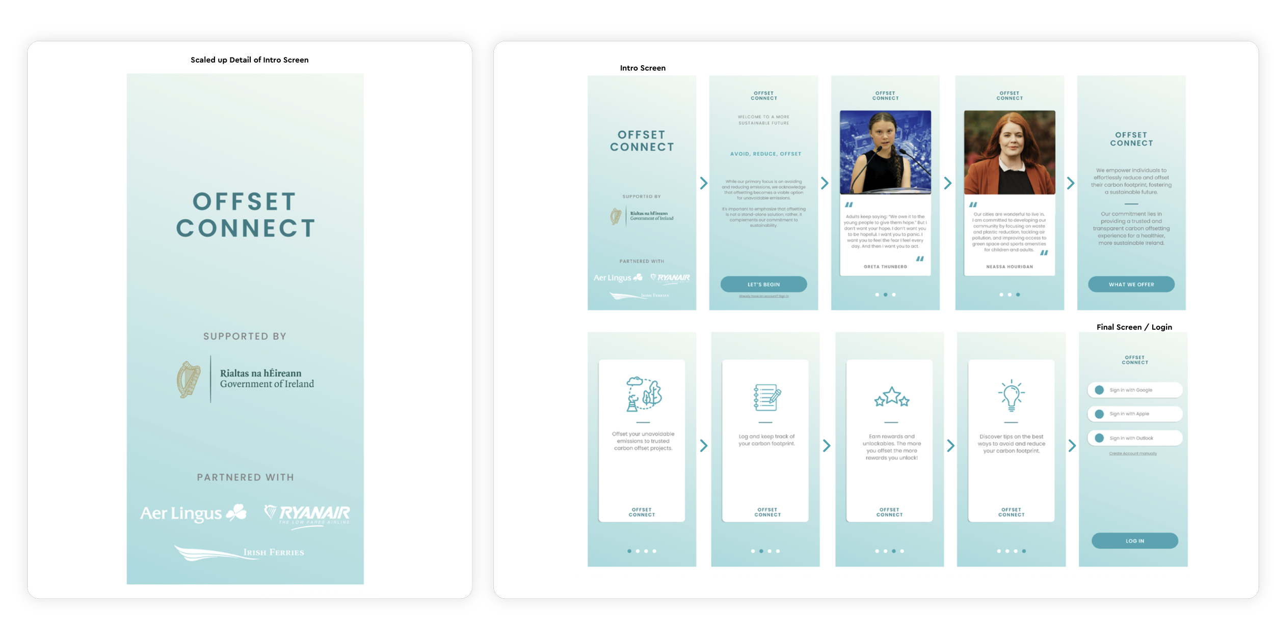
Final Onboarding Flow – Informed by Testing
Check-out Integration – Improving Discoverability
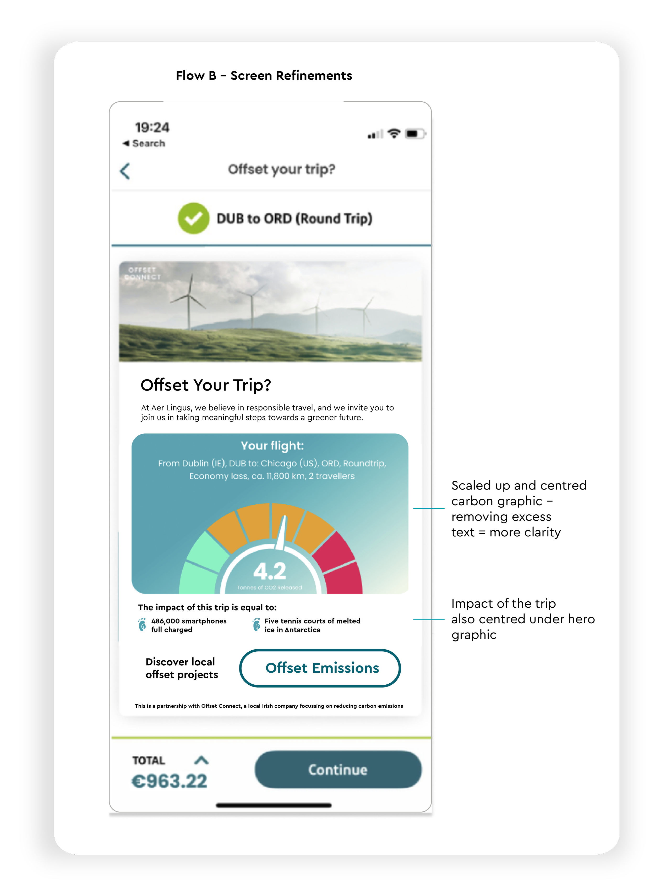
Informed by Usability Testing
Ease of Use — Reducing Cognitive Load
Informed by Testing
Validation & Next Steps
To move beyond prototype validation, the next phase would focus on real-world implementation and long-term engagement:
Live A/B Testing:
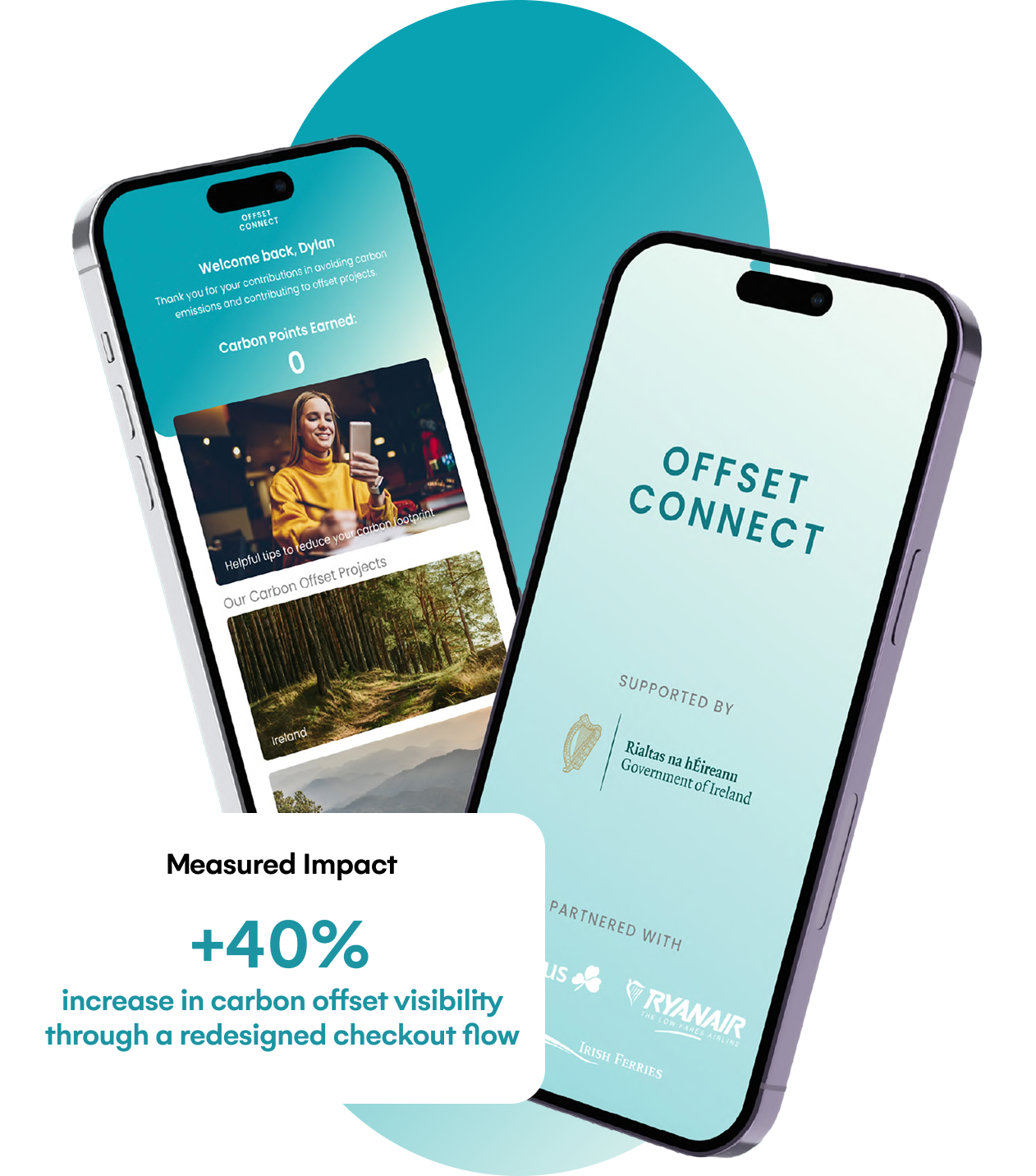
Deploy the dedicated offset flow within a live checkout to measure impact on visibility, aiming to increase awareness from ~20% to >50% without reducing checkout completion.Success Metrics Definition:
Track offset attach rate, awareness, and revenue contribution, ensuring no negative impact on conversion.Trust & Transparency Enhancements:
Introduce additional credibility signals such as third-party certifications and clearer impact breakdowns to address user skepticism.Long-term Engagement & Behaviour Change:
Introduce carbon tracking, progress visualisation, and reward mechanisms to drive sustained engagement beyond a single transaction.Pricing & Sensitivity Testing:
Test pricing models and framing to optimise adoption without increasing perceived friction.
The findings highlighted a disconnect between environmental concern and confidence in existing sustainability solutions. Participants wanted proof, clarity, and accountability rather than broad “green” claims.
This shifted the design focus away from persuasion and toward:
making carbon impact tangible,
increasing transparency around calculations and offsets,
and designing feedback loops that encourage long-term behavioral change.
The opportunity was not to convince users to care — they already did. The challenge was earning their trust.
What I Learned
I went into this project assuming users didn't trust carbon offsetting — and the research confirmed it. But the why was more nuanced than I expected.
It wasn't cynicism about whether offsets work. It was a proximity problem. Offsetting a flight by funding a rainforest in Brazil felt abstract and unverifiable. When participants understood they could offset to a local Dublin project — trees planted in a park they walk past — scepticism dropped noticeably. Visible, local impact changed everything.
The generational split was also sharper than anticipated. Millennials and Gen Z didn't need convincing that climate action mattered — they needed convincing this mechanism was genuine. That distinction directly shaped the trust-building elements of the onboarding design.
The hardest moment was early usability testing. Initial reactions to carbon offsetting at checkout were often dismissive before participants had even seen the design. I adapted by leading sessions with the local impact concept first, then showing the prototype. That sequencing change significantly improved the quality of feedback — and taught me something I've carried into every research project since: how you frame a concept before testing it matters as much as the design itself.