Atlas — B2B SaaS Website Redesign
Atlas was repositioning its brand — but the website was still telling the old story. Navigation reflected internal product taxonomy rather than how buyers actually evaluate vendors. Conversion momentum was being lost before users ever reached sales.
UX Lead · B2B SaaS / HR Tech · 2024–Ongoing
Research & Key Insights
Heuristic Analysis
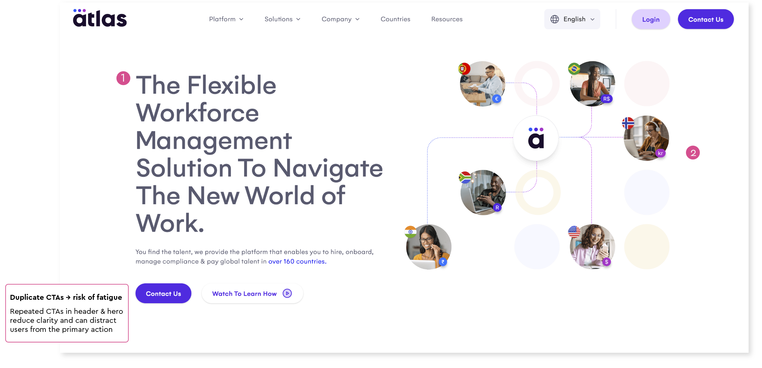
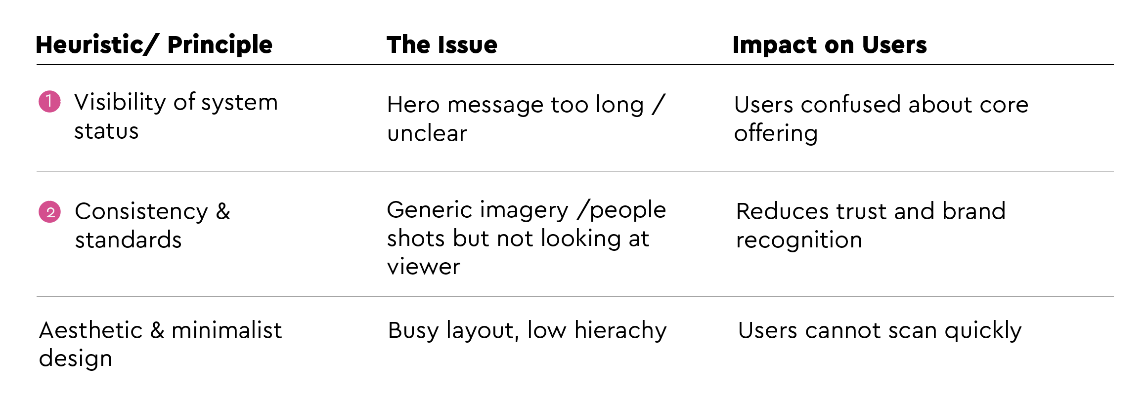
A Heuristic analysis of the existing homepage identified three core issues: unclear value proposition, generic imagery reducing trust, and a busy layout preventing quick scanning.
Stakeholder Alignment
Before exploring solutions, I ran stakeholder alignment sessions to define what success looked like — and critically, what the new site should not do.
This alignment shaped three key principles for the redesign:
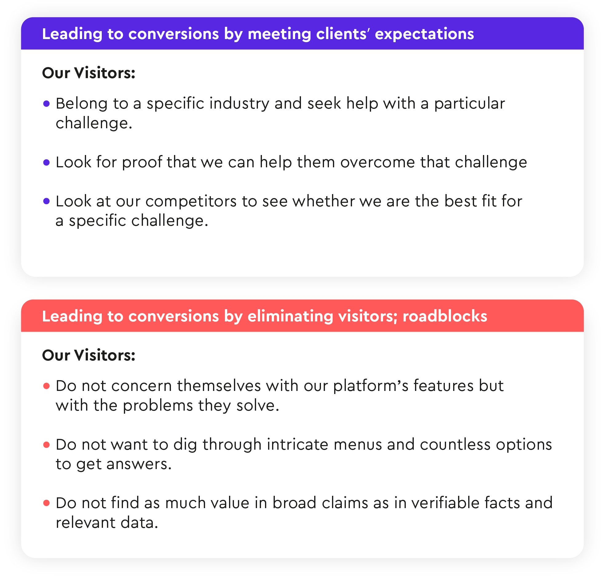
Our new site should:
Should focus on solutions and demonstrate our deep understanding of challenges in specific industries.
Must convince visitors of our expertise and proven track record in dealing with these challenges.
Must make user journeys intuitive, engaging, and highly relevant to their needs.
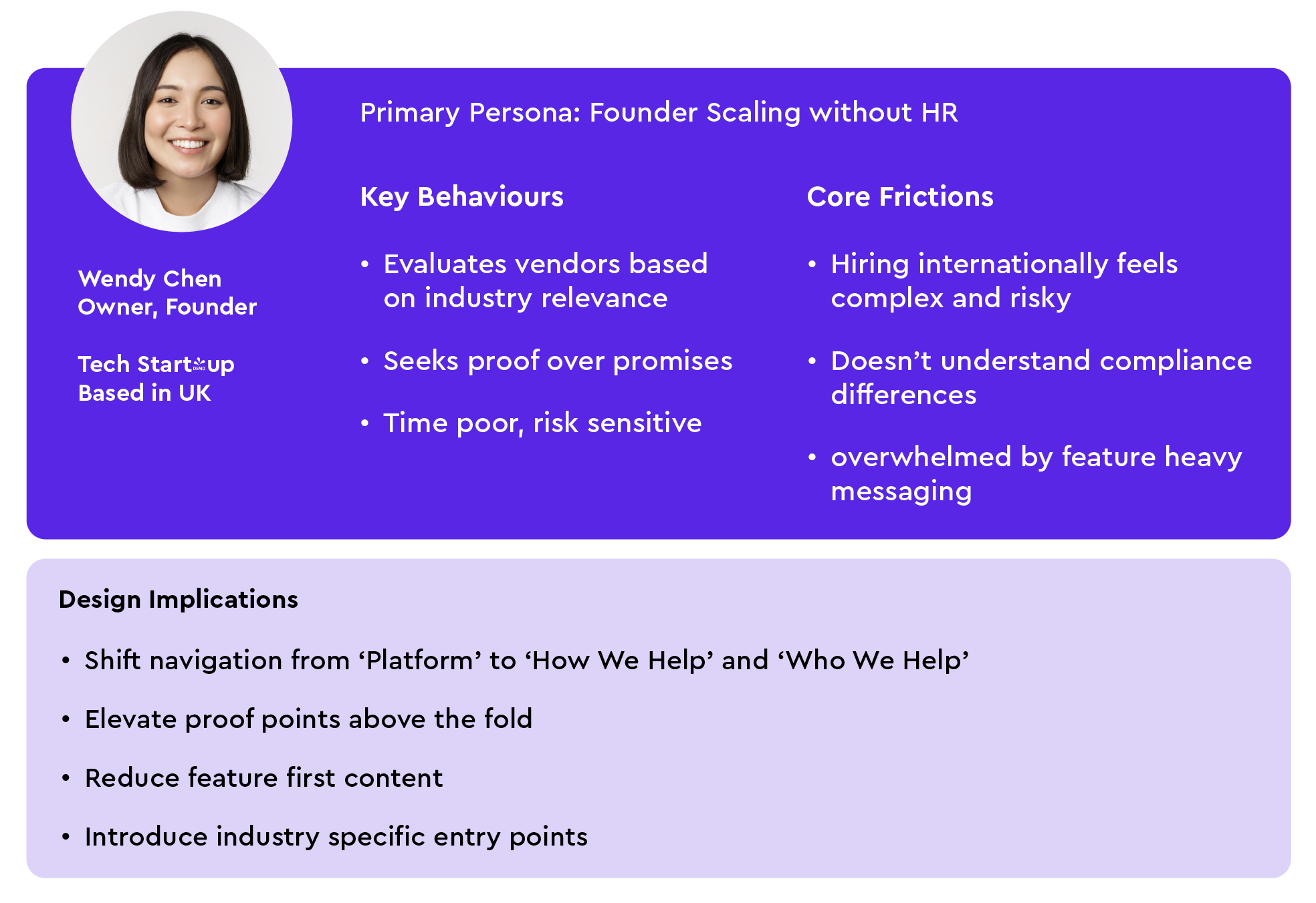
Creating Personas / Empathise
Primary persona developed from user research and sales team interviews — directly informing navigation structure, messaging hierarchy and trust strategy.
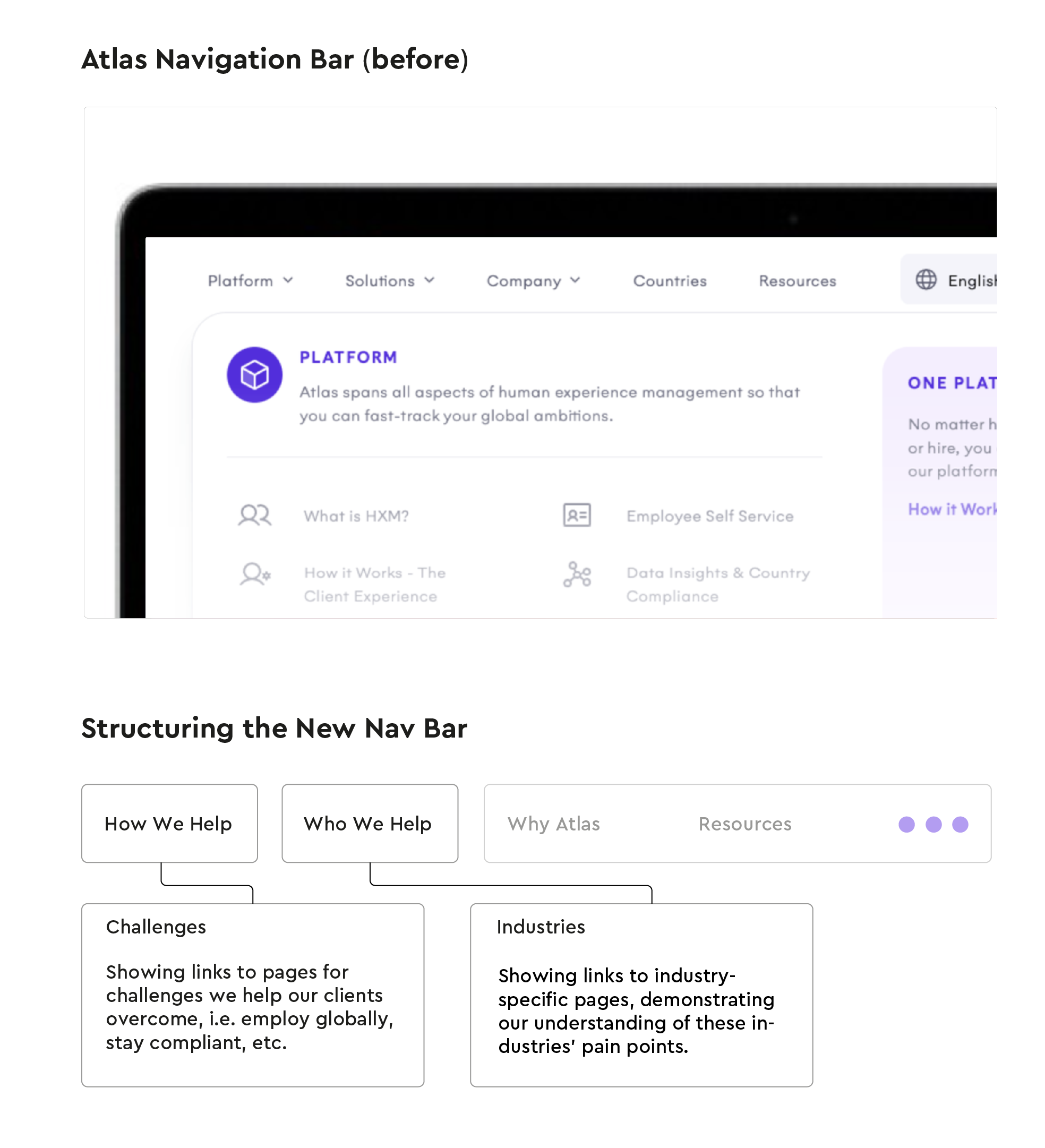
Navigation Strategy
Aligning the navigation with our value proposition
Competitive benchmarking of 7 global employment platforms revealed 63% led with platform-first navigation — a pattern that doesn't match how buyers actually evaluate vendors.
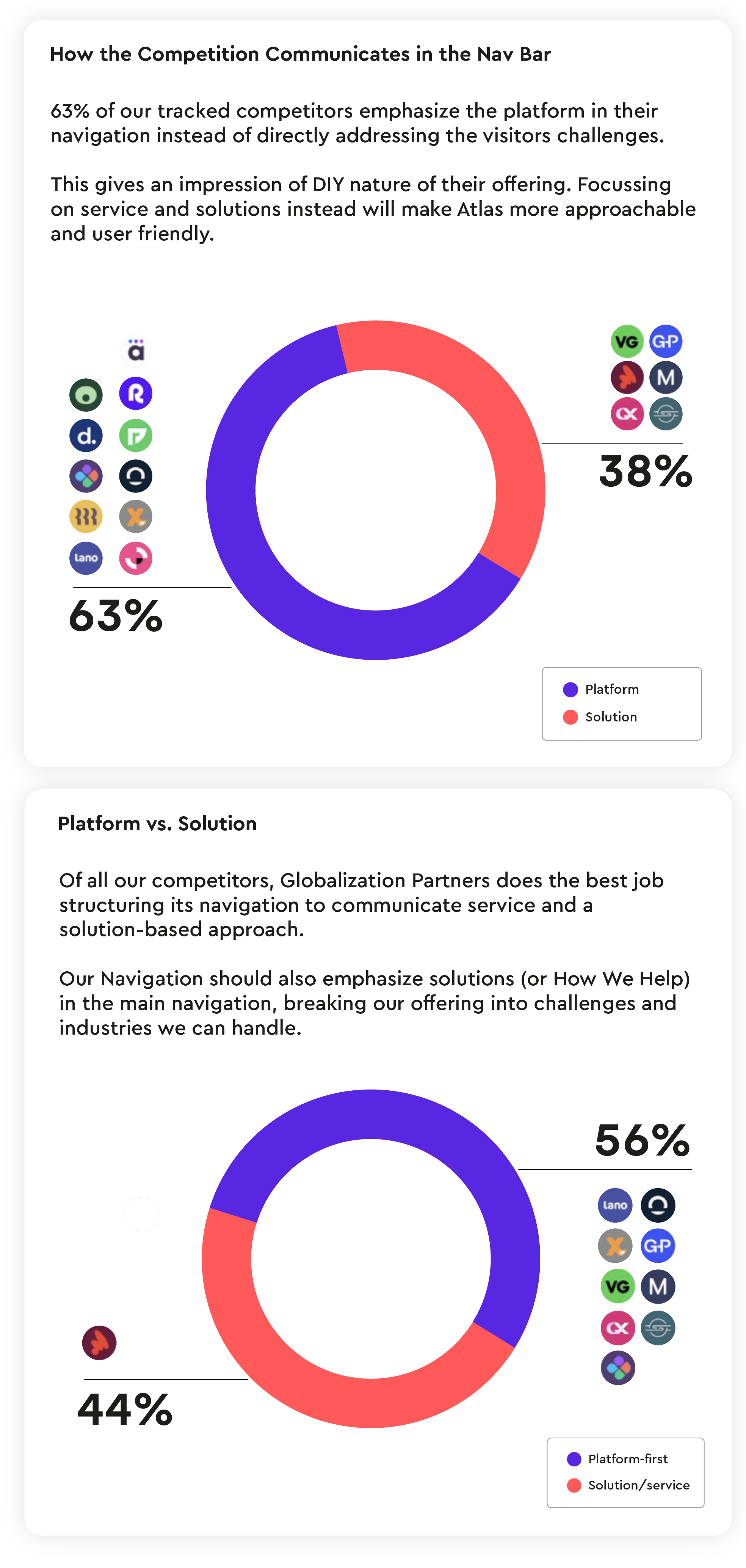
Information Architecture Benchmarking
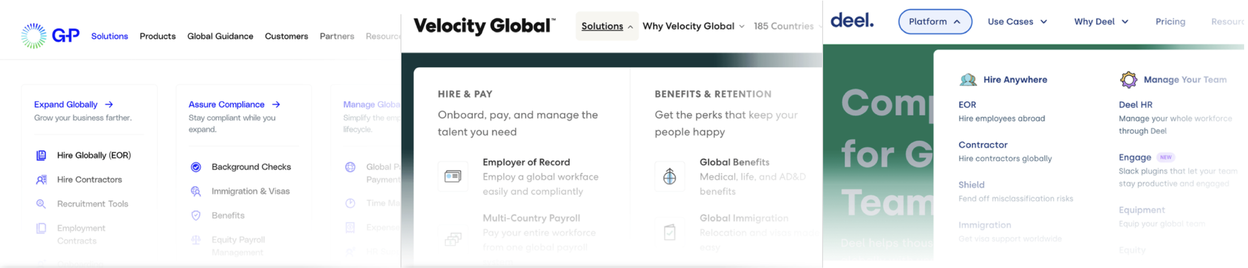
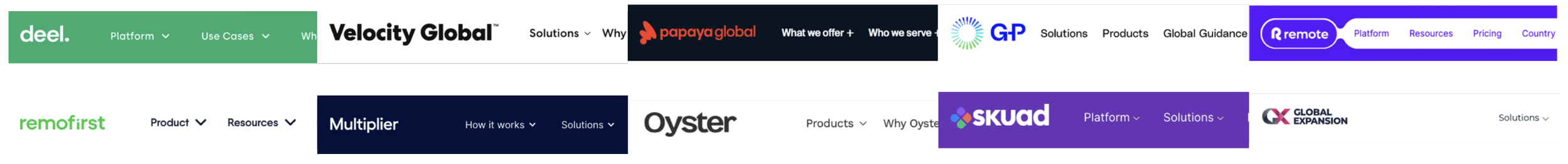
To inform the restructuring of Atlas’s primary navigation, I conducted a comparative analysis of leading global employment platforms (Deel, Velocity Global, Remote, Papaya, Oyster, etc.).
Key Patterns Identified
Solution-First Framing
Most competitors lead with a “Platform” or “Solutions” category, immediately orienting users around core offerings.Trust-Building Secondary Navigation
“Why Us” sections are consistently positioned near the top-level navigation to reinforce credibility and differentiation.Centralized Resource Hubs
All competitors consolidate educational content (guides, tools, compliance knowledge) under a “Resources” dropdown, reinforcing thought leadership.
Designing Around User Intent
Based on competitive analysis and internal positioning, I restructured the primary navigation around two core user entry points:
How We Help — problem-first orientation
Who We Help — audience-first orientation
Aligning Navigation to User Intent
User research and sales insights revealed two dominant mental models:
Some visitors arrive with a specific challenge (e.g., “How do I employ globally?”)
Others arrive identifying with an industry or company type (e.g., “We’re a fintech scaling internationally.”)
Rather than forcing users into a product taxonomy, we aligned the navigation to their intent.
Our new site should not:
Distract visitors with feature explaining pages, adopting challenge/solution approach instead.
Link all available pages in navigation, but reveal them strategically in context of their journey.
Overwhelm with long pages filled with descriptive content and no driver.
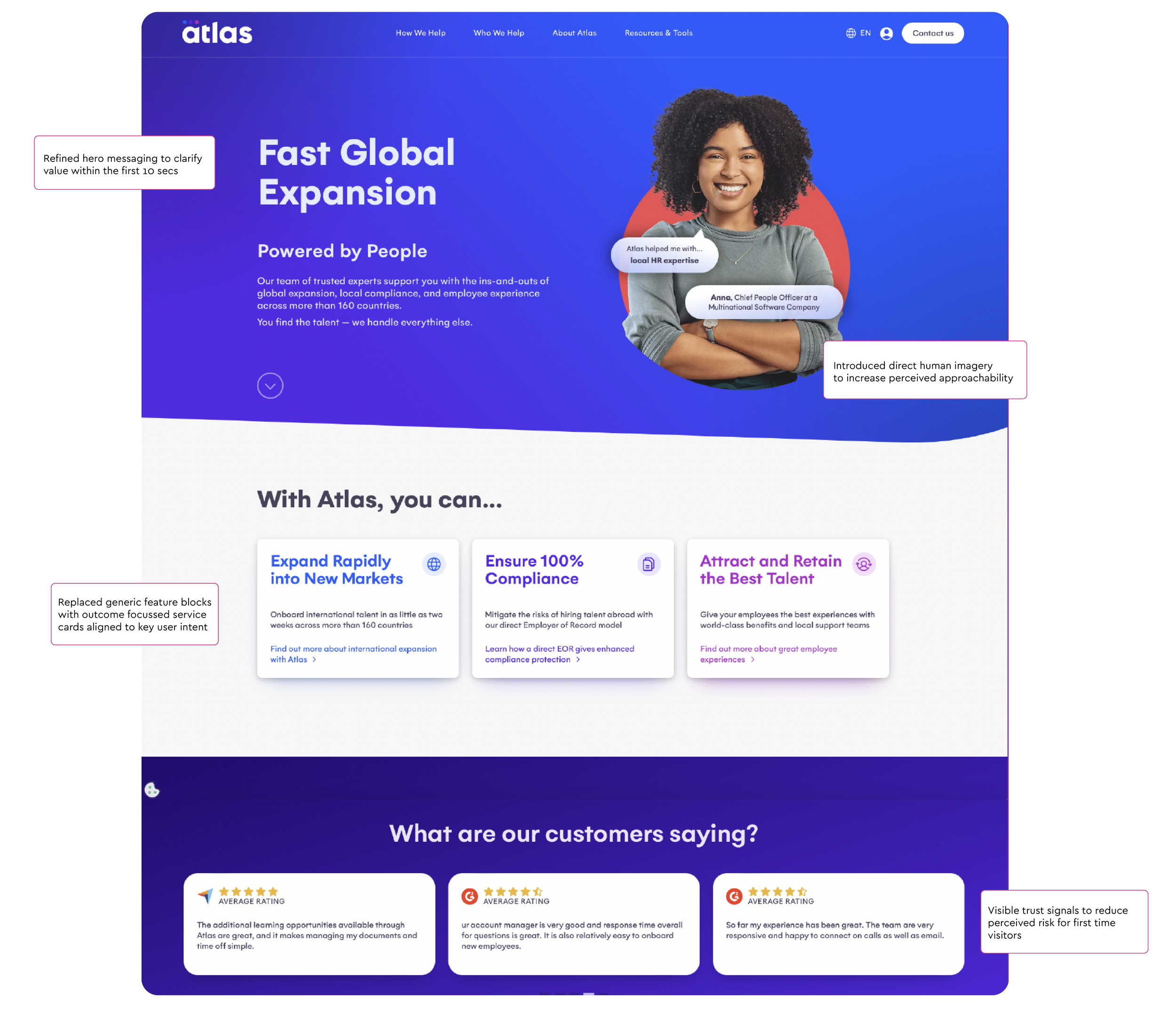
Designing for Trust and Approachability
We hypothesised that direct human imagery would increase perceived approachability and trust.
Participants consistently described the updated imagery as “more human” and “less corporate,” reinforcing the intended brand shift.

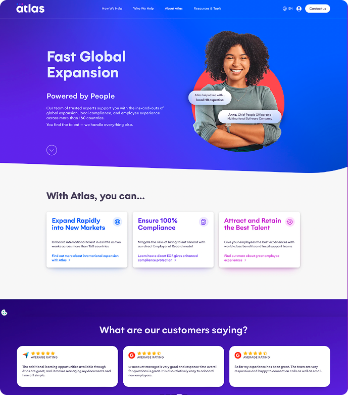
Optimising the Landing Page for Conversion
From Research to Conversion Strategy
Building on earlier research insights, the landing page was restructured to shift from internal service categories to clearer, intent-driven pathways.
The goal was to:
Clarify value within the first 10 seconds
Build credibility quickly
Guide users toward high-intent service pathways
Increase demo-driven conversions
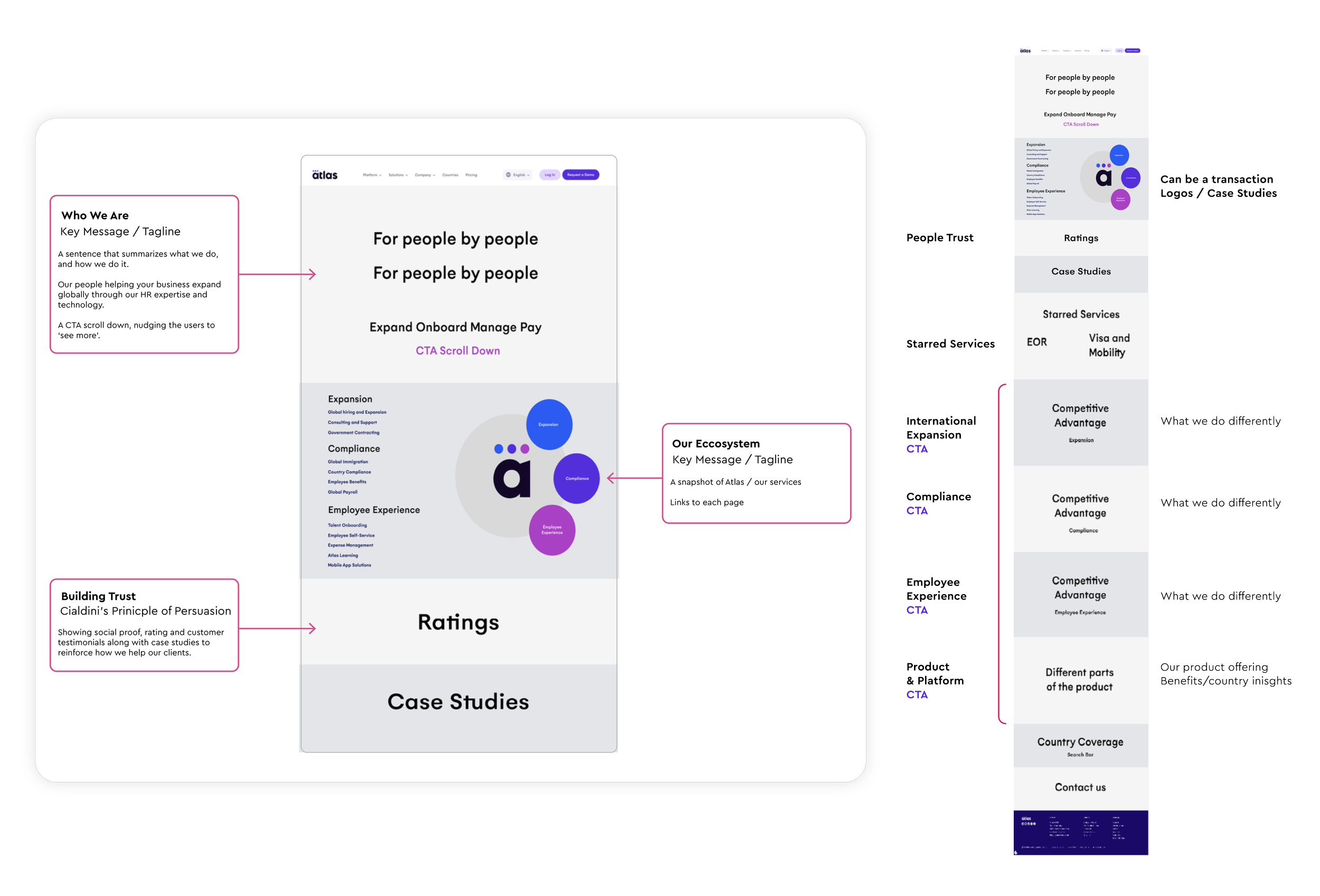
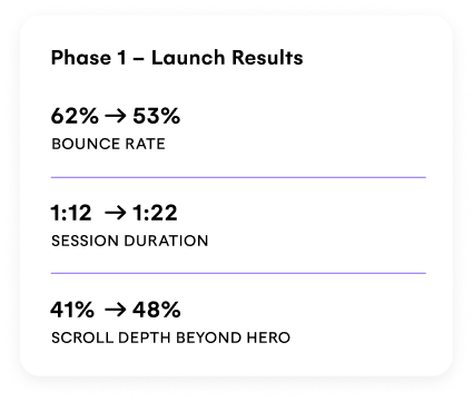
Landing Page Results & Impact
The landing page was redesigned around user intent, shifting from product-led messaging to a clearer, trust-focused, conversion-oriented experience.
Phase 2
Streamlining the Conversion Path
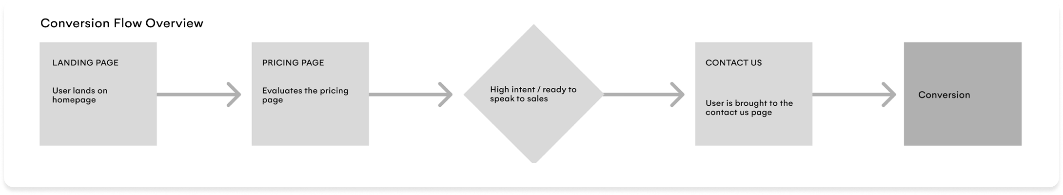
Post-launch analysis revealed friction at the point of conversion. Mapping the end-to-end journey helped identify where momentum was being lost and opportunites where we can improve.
(example in the flow below, to continue user momentum and intent)
High Intent Behaviour
Decision Validation moment
Proximity to Conversion
Leadership Alignment
Why the Pricing Page Matters
The pricing page consistently emerged as a high-intent touchpoint prior to conversion. Users arriving here were actively evaluating fit and readiness to engage, making it the most impactful place to address conversion friction.
Research & Validation
To validate where and why users were experiencing friction prior to conversion, I combined behavioral analysis with competitive pattern research and usability testing. This allowed me
to understand not only what users were doing, but whether our experience aligned with their expectations at a high-intent moment.
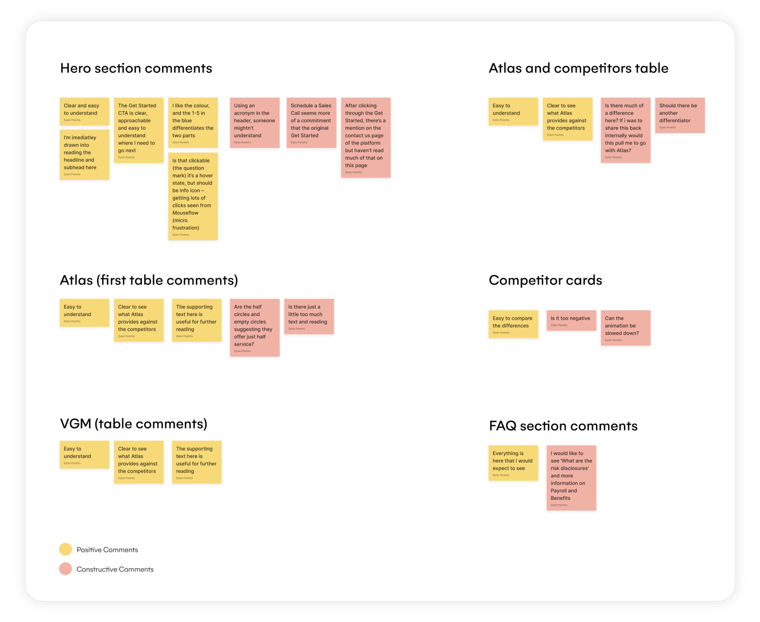
Behavioural Analysis (Mouseflow)
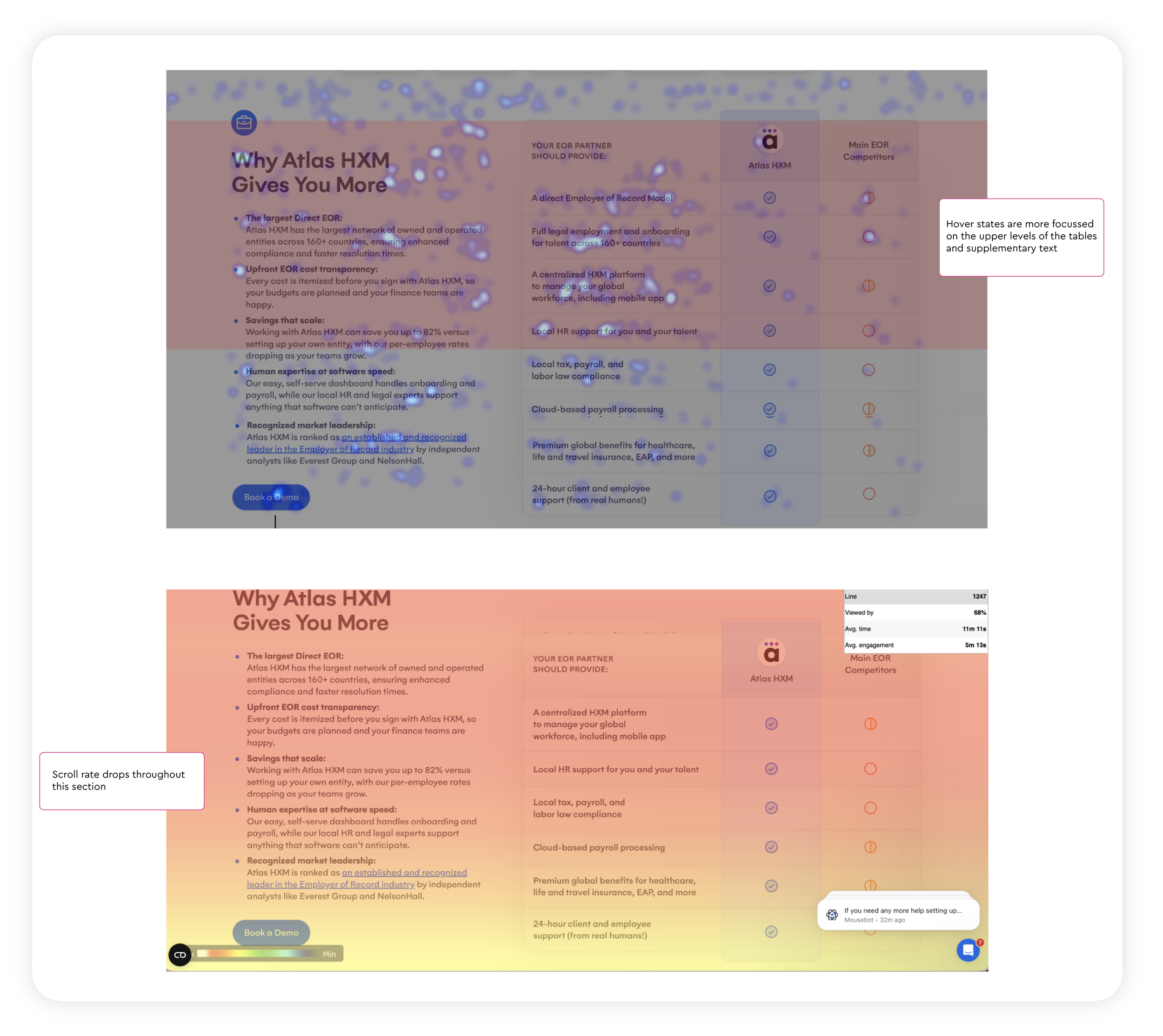
Analysis of the Atlas pricing section compared to competitors revealed that users concentrated their attention on the upper portion of the table and adjacent supplementary text, with interaction dropping significantly further down. Scroll depth metrics confirm limited engagement with lower content.
These findings suggest that extended content beyond the top of the table is not effectively supporting decision making.
Simplifying and prioritising the most critical information at the top would better align with user behaviour, preserve momentum at this high intent stage, and improve clarity and accessibility of the pricing information.
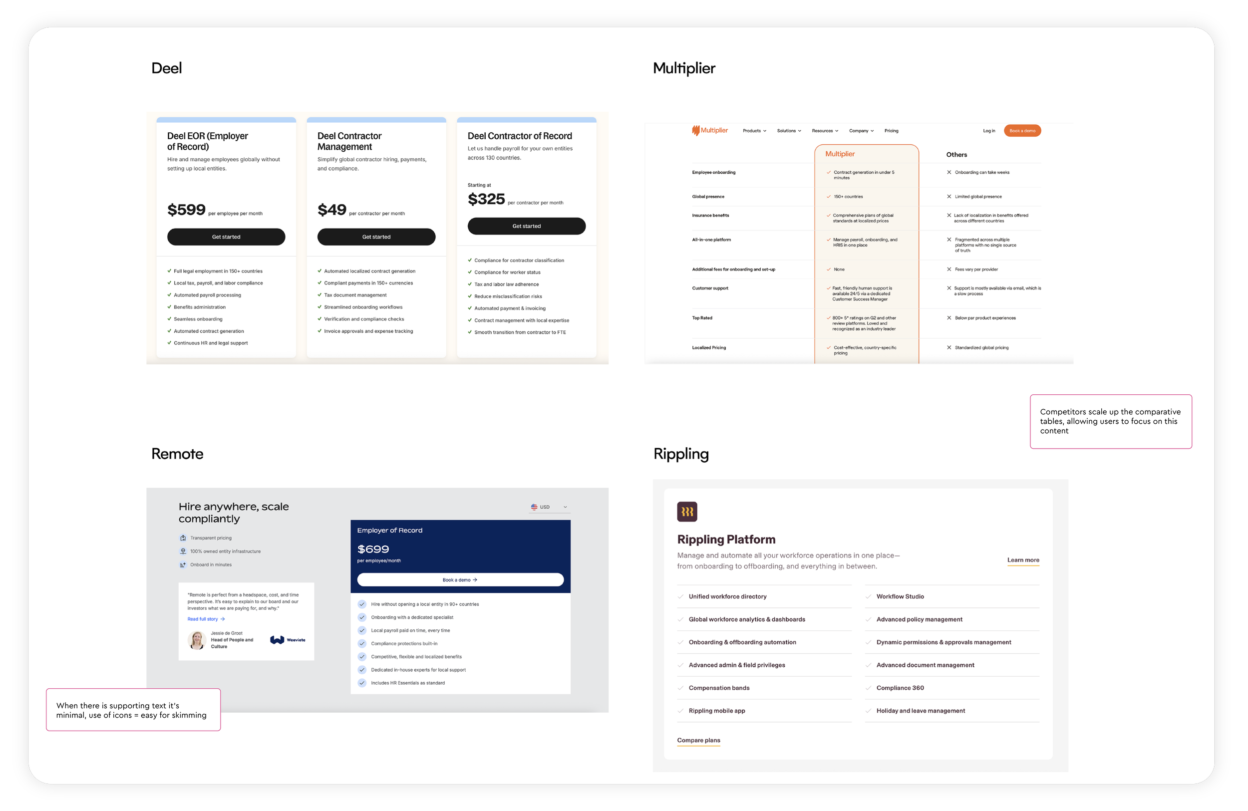
Competitive Pattern Analysis
A review of competitor pricing pages revealed a consistent pattern: pricing tables were treated as the primary decision-making element, often presented at scale with minimal supporting copy. In contrast, Atlas HXM’s pricing layout combined tables with dense explanatory text, increasing cognitive load at a moment where users were seeking clarity and reassurance.
Usability Testing
Usability testing further reinforced these findings. Participants expressed a preference for concise, scannable information on pricing pages and noted that the volume of text made it harder to quickly understand next steps or feel confident moving forward.
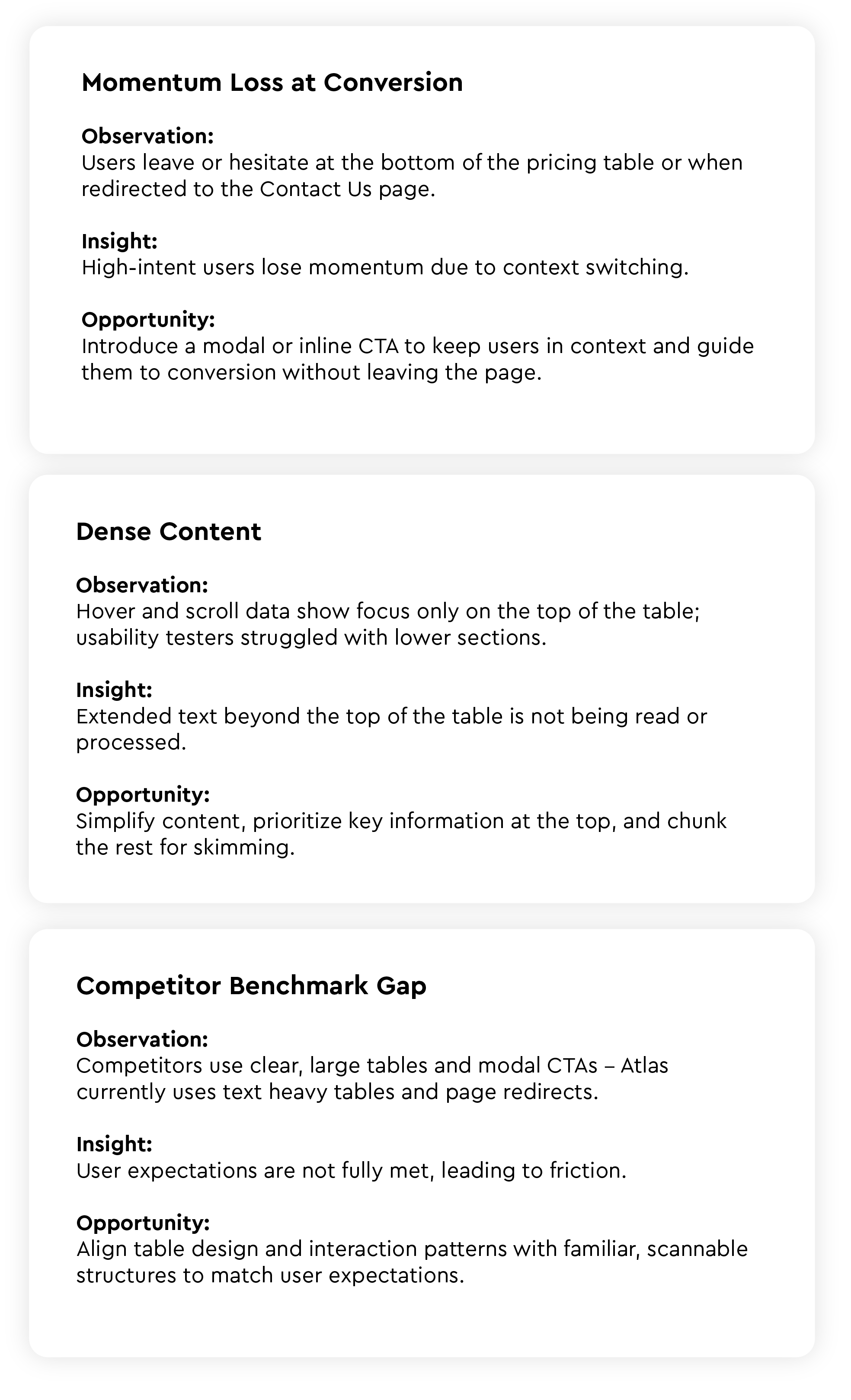
Key Insights & Friction Points
Proposed Iterations
Optimising Conversion Flow to Address Momentum Loss
To address the loss of momentum at the point of conversion, the focus should be on keeping users in context once intent has been established. Behavioral data shows that users who click a “Get started” CTA are ready to act, yet the current flow redirects them to a separate Contact Us page, introducing unnecessary friction at a high-intent moment.
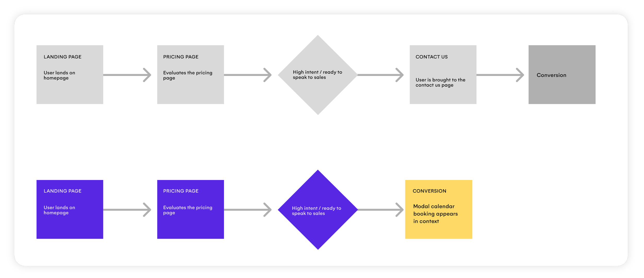
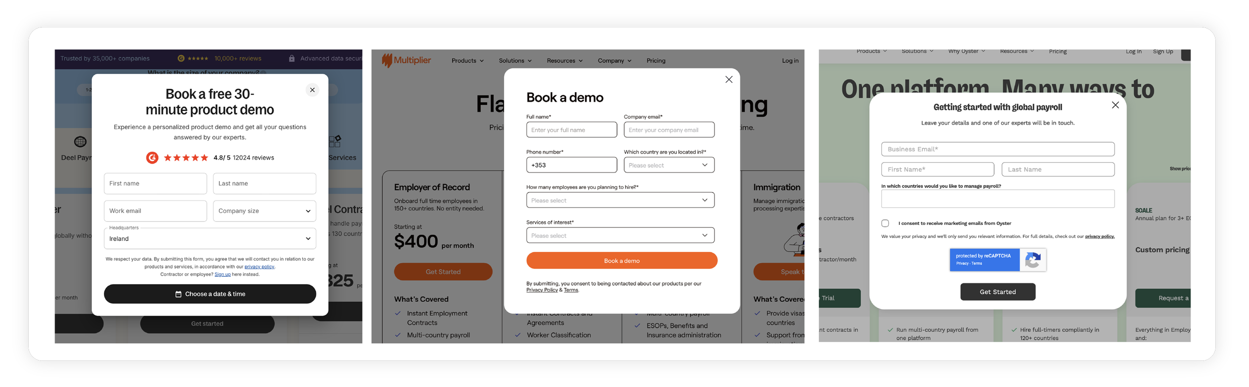
Competitor Analysis of Clicked CTA
Looking at what happens when users are on our competitor pages and ready to act, a modal pop-up appears instantly. This keeps the user focussed on the task at hand, inputting the details and setting up a meeting. Our current flow brought users to our contact us page, with a scroll down to the form.
Proposed Iterations to Address Dense Content
As an initial optimisation I proposed testing an in-context modal triggered by the CTA. This approach allows users to engage immediately without leaving the pricing page, preserving momentum and aligning with established competitor patterns at this stage of the journey.
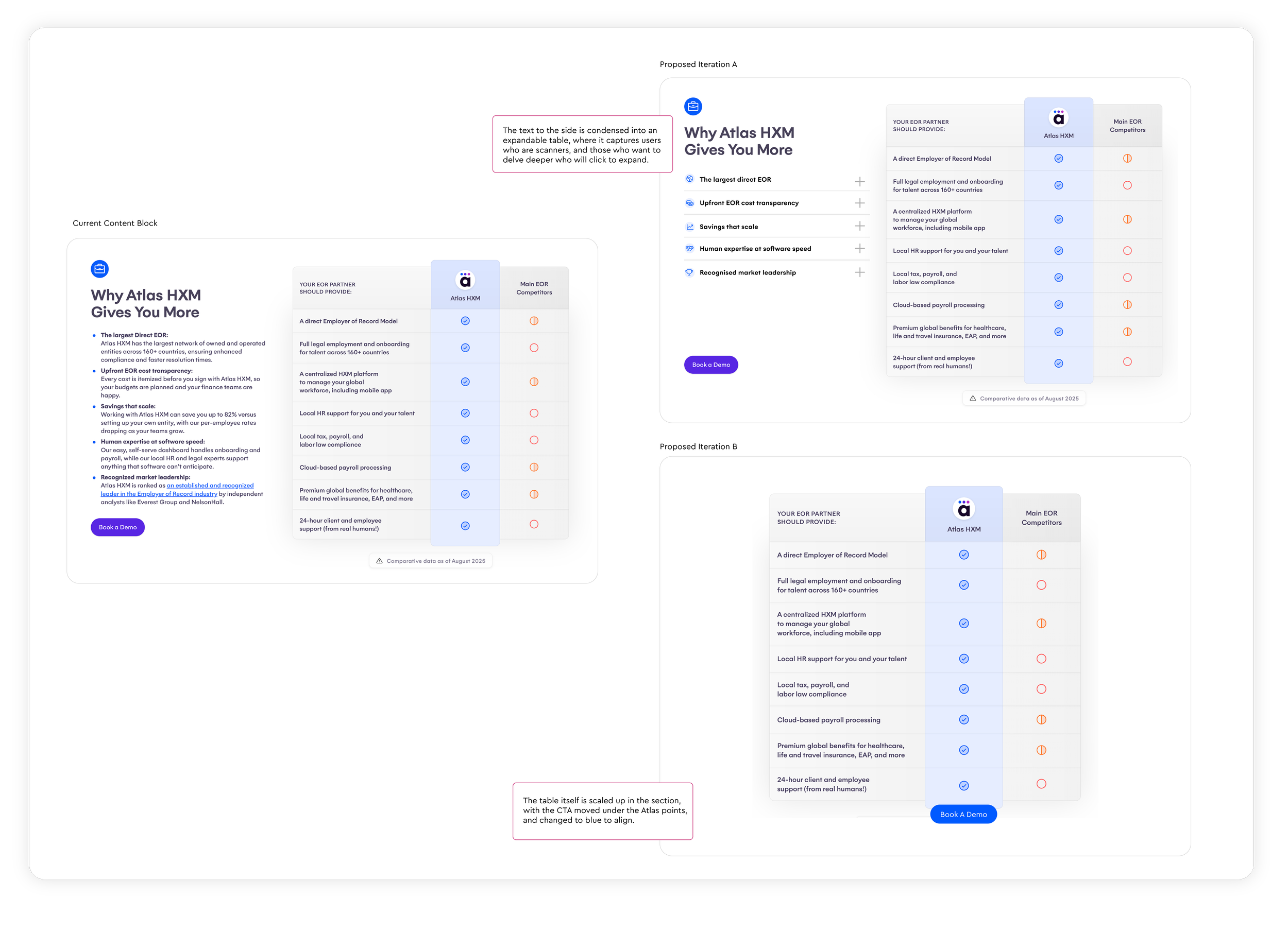
The research showed our users are scanning the page, therfore we need the content to be clear and easy to skim/scan the page. By proposing an expandable menu we can capture the scanner who will just see the headers, and those who want to delve deeper. The B option goes further and removes this text (either we move the text further down the page, or above it) but making the table the star of the show and what the user will focus on here.
Validation & Next Steps
The next phase of work will focus on validating these proposed improvements and measuring their impact on user behavior and conversion performance. Key next steps include:
Validate the revised flow by testing the modal-based CTA against the existing page-redirect flow to assess whether keeping users in context improves engagement and task completion.
Evaluate content simplification approaches by testing:
Option A: An expandable secondary panel that allows users to access additional information without overwhelming the primary decision-making view.
Option B: A simplified pricing experience that removes supporting text entirely and scales the table to function as the primary decision-making element.
Measure success through a combination of:
Conversion rate from pricing to sales contact
Engagement with primary CTAs
Scroll depth and interaction patterns
Follow-up usability testing to assess clarity and confidence
Insights from these tests will inform final design decisions and guide further iteration of the pricing experience.
What I Learned
The most impactful insight from this project wasn't a design decision — it was learning how to build an evidence base that gets leadership buy-in quickly.
Combining Mouseflow behavioural data with competitive benchmarking and usability testing gave every design recommendation a three-source validation that was hard to argue with.
In a B2B environment where design has to serve sales, marketing and product simultaneously, that ability to speak in data is what moves work forward.